
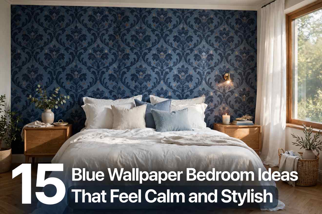
15 Blue Wallpaper Bedroom Ideas That Feel Calm and Stylish
Blue wallpaper in a bedroom sounds like a gamble. Go too dark and the room feels like a cave; too pale and it reads as a nursery; pick the wrong pattern and you’re stuck staring at it every morning. That’s the fear that keeps most people on safe white walls — and the reason blue, done right, looks so striking when someone finally commits. The trick isn’t avoiding blue, it’s matching the shade and scale to your light, your furniture, and how you actually use the room. Below are fifteen genuinely different ways to do it — from one dramatic navy wall to a whisper of powder blue — each with a practical path to recreate it.
1. The Navy Statement Wall Behind the Bed
A deep navy wallpaper with a subtle linen texture on the headboard wall alone gives the room an instant focal point without overwhelming it. Keep the other three walls a warm white so the navy reads as rich rather than cave-like. The trick here is the bedding: crisp white sheets with a camel or rust throw pull warmth from the dark wall. Wallpaper just the headboard wall, floor to ceiling, and let a tall upholstered headboard overlap the pattern.
Quick Win: Order three large peel-and-stick navy samples first and live with them on the wall for two evenings — navy shifts dramatically between daylight and lamplight.

2. Powder Blue on All Four Walls
In a small bedroom, pale powder blue on every wall makes the boundaries recede and the room feel larger, not smaller. Keep the ceiling bright white and choose light oak or whitewashed furniture so nothing heavy interrupts the airy effect. What makes this work is restraint everywhere else: linen curtains in nearly the same tone as the walls, one soft rug, minimal art. If your room feels boxy and flat, this single enveloping color is the fastest way to give it atmosphere without adding a single object.

3. Classic Blue-and-White Floral
A medium-scale indigo floral on a white ground is the cottage look that never dates. Pair it with white painted furniture and a natural jute rug so the pattern stays the star, and keep bedding solid white — busy florals need breathing room to feel fresh rather than fussy. This works especially well in rooms with traditional trim or a fireplace, where the wallpaper feels like it belongs to the architecture. Choose a repeat under twelve inches so the motif reads as charming, not overwhelming, at bedroom distance.
Quick Win: If a full room feels like too much, wallpaper just the wall behind the bed and paint the rest a white pulled from the wallpaper’s background — you get the look for a quarter of the cost.

4. Moody Teal with Warm Wood
Deep teal-blue wallpaper turns cold fast unless you answer it with warmth, so this idea lives or dies on the wood tones. Walnut or honey-oak furniture, brass picture lights, and amber-toned bulbs keep the room feeling cocooning instead of chilly. It’s a strong choice for north-facing bedrooms that never get direct sun, where pale colors can look grey and sad. Keep textiles nubby — a wool throw, velvet cushions — because matte surfaces drink up the lamplight this palette needs.

5. Vertical Blue Stripes to Lift a Low Ceiling
Narrow tonal stripes in two close blues draw the eye upward and can make an eight-foot ceiling feel a foot taller. Paint the ceiling the palest stripe color so the lines appear to continue overhead, and keep the bed low-profile so the vertical rhythm dominates. What makes this work is subtlety — high-contrast stripes feel nautical and busy, while tone-on-tone reads as texture. This works especially well in attic or basement bedrooms where the ceiling height is the room’s biggest weakness.
Quick Win: Hang curtains as close to the ceiling as possible and let them kiss the floor — the unbroken vertical line doubles the heightening effect of the stripes.

6. Chinoiserie Panels for Quiet Luxury
Hand-painted-look blue chinoiserie — delicate branches and birds on a soft cream ground — brings an old-world elegance that flat paint can’t touch. Use it on one wall only, and keep the furniture simple and modern so the room feels collected rather than stuffy. A simple way to recreate it is to frame the wallpaper panels with thin painted molding, which makes even a standard print look like custom wall panels. This suits formal primary bedrooms where you want the walls to feel like art.

7. Denim-Blue Grasscloth Texture
Natural grasscloth in a washed denim blue adds the kind of texture that hides imperfect walls and makes a room feel instantly relaxed. The woven surface catches light differently through the day, so the color feels alive rather than flat. Pair it with rattan, washed linen, and light woods for an easy coastal-casual bedroom. Because the texture does the talking, keep the pattern elsewhere quiet — solid bedding, one simple rug — and let the walls carry the whole design.
Quick Win: Grasscloth shows seams more than printed paper, so hire the hanging out if you’ve never done it — a bad seam will bother you daily, while a pro job looks seamless for a decade.

8. The Fifth Wall: A Pale Blue Ceiling
Wallpapering the ceiling in pale blue is the surprise move most guests remember. Keep the walls a warm white and the bedding simple, and the soft blue overhead reads like sky — calming without demanding attention. If your room feels plain but you don’t want a feature wall competing with your art or headboard, this is the answer. It works particularly well in bedrooms with interesting ceiling architecture, like beams or a tray ceiling, where the color highlights the shape.

9. One Oversized Botanical Mural
A single-wall mural with large-scale blue botanical prints — oversized leaves or branches — acts as artwork you never have to hang. Scale the motif to the wall: bigger walls need bigger repeats or the print looks timid. Keep everything else in the room quiet — solid bedding, minimal furniture — so the mural holds the eye. For a softer look, choose a design with plenty of negative space in the background color rather than an all-over dense print, which can feel heavy behind a bed.
Quick Win: Measure your wall and check the mural’s panel width before ordering — most murals come in fixed panels, and you want the main motif centered behind the bed, not sliced by a seam.

10. Indigo Block-Print Pattern
Hand-blocked-look indigo patterns bring an artisan, bohemian warmth that feels personal rather than decorated. The slight irregularity of the print is the whole point — it keeps the room from feeling stiff. Pair it with natural wood furniture, white cotton bedding, and warm textiles like a kantha quilt so the global-traveler vibe feels collected, not themed. Choose a small repeat for this one; intricate small patterns read as texture from across the room and reward a closer look.

11. Dusty Blue with Aged Brass
Muted dusty blue wallpaper paired with aged brass is the combination that makes a bedroom feel quietly expensive. The grey in the blue keeps it sophisticated, while warm metal — sconces, drawer pulls, a mirror frame — stops it feeling flat. Swap basic bedside lamps for plug-in brass sconces to free up nightstand space and add a jewelry-like glow at eye level. This palette loves natural light but also flatters lamplight, so it works in rooms used both day and night.
Quick Win: If new sconces aren’t in the budget, spray-paint existing lamp bases in aged brass and swap in warm 2700K bulbs — the metal-and-glow pairing is what sells the look.

12. Blue Gingham for Farmhouse Cozy
A blue-and-white gingham check is farmhouse coziness without the clichés — playful, calm, and forgiving of real life. It loves whitewashed wood furniture, quilted bedding, and simple cotton curtains. Because the pattern is geometric and regular, it suits rooms where you want order and cheer rather than drama. Keep the check scale medium: tiny gingham reads as texture, oversized checks feel modern-farmhouse. Either way, let the bedding stay simple so the walls keep their crisp charm.

13. Watercolor Ombre Wash
A watercolor ombre that drifts from deep blue at the bottom to pale sky at the top feels like sleeping inside a calm sea mist. Use it on one wall — usually behind the bed — and keep furniture minimal and low so the gradient reads uninterrupted. Solid bedding in a tone pulled from the middle of the gradient ties the room together. This is the most artistic option on the list, and it suits creative minimalists who want one expressive moment in an otherwise quiet room.

14. Wallpaper Just the Alcove or Reading Nook
You don’t need four walls — papering a single alcove, wardrobe recess, or reading corner in deep blue creates a cocooned zone inside a neutral room. Tuck an armchair, a small lamp, and a bookshelf into the nook and it becomes the spot everyone gravitates to. This is ideal when you love bold wallpaper but share the bedroom with someone who doesn’t, or when the room’s architecture already gives you a natural frame. The contrast between the deep nook and the calm room makes both feel intentional.
Quick Win: Paint the inside of the alcove’s trim or shelving the same deep blue — wrapping the color around the edges makes a small papered area look custom and finished.

15. Peel-and-Stick Blue for Renters
Peel-and-stick wallpaper has grown up — the patterns now rival traditional paper, and it comes down cleanly when the lease ends. It’s the low-commitment way to test whether you actually love living with blue before investing in the real thing. Always order a sample first and stick it up for a week; blues shift with your room’s light more than any other color. Go bolder than you think — because it’s temporary, this is the one place to try the dramatic navy or large-scale print you’d hesitate to paste permanently.

Conclusion
Blue wallpaper rewards commitment more than any other bedroom choice — the rooms people remember are the ones where someone picked a shade and styled around it with confidence. You don’t need to redo everything; one wall, the right bedding, and lighting that flatters the color will carry most of the effect. Start with the idea that matches your light and nerve, live with a sample for a few days, and let the room tell you how bold to go.
Frequently Asked Questions
What shade of blue wallpaper is best for a bedroom?
It depends on your light. North-facing or dim rooms suit warmer blues with grey or green undertones, like dusty blue or teal, which won’t read as cold. Bright, south-facing rooms can handle crisp navy or powder blue beautifully.
Does dark blue wallpaper make a bedroom look smaller?
Only if it’s on all four walls with no contrast. Used on one accent wall with lighter walls elsewhere, dark blue actually adds depth and makes the room feel more layered. Keep bedding and trim light to maintain balance.
Can I put blue wallpaper in a small bedroom?
Yes — pale blues like powder or sky blue can make a small bedroom feel larger by softening the wall boundaries. If you love dark blue, confine it to one wall or an alcove so the room keeps its airiness.
What color bedding goes with blue wallpaper?
White is the safest and freshest choice with almost any blue. For warmth, add camel, rust, or mustard accents; for a calm tonal look, layer lighter and darker blues. Avoid bedding that exactly matches the wallpaper or the bed disappears into the wall.
Should I wallpaper all walls or just one?
One accent wall — usually behind the bed — is the most forgiving and the most popular choice. Full-room papering works best with pale or small-scale patterns. When in doubt, start with one wall; you can always add more later.
Is blue wallpaper still in style?
Blue remains one of the most consistently popular wallpaper colors because it works across styles, from coastal to traditional to modern. What dates a room is usually the pattern scale or quality, not the color itself — classic motifs in good materials age well.
What furniture colors work with blue wallpaper?
Light oak, walnut, white painted wood, and rattan all pair beautifully with blue. Warm metals like brass and aged gold complement it, while chrome can feel cold. Keep at least one warm element in the room to balance blue’s coolness.
Peel-and-stick vs traditional wallpaper for a bedroom?
Peel-and-stick is ideal for renters and commitment-phobes, and quality has improved enormously. Traditional pasted wallpaper looks richer, lasts longer, and suits textured options like grasscloth. For a forever home, traditional is worth it; for experimenting, start with peel-and-stick.
How do I stop blue wallpaper looking cold?
Layer in warmth: wood furniture, brass lighting, amber-toned bulbs around 2700K, and textiles like wool throws and velvet cushions. Matte, nubby textures absorb light cozily, while cool lighting and chrome will push the room toward chilly.
Can renters use wallpaper in the bedroom?
Absolutely — peel-and-stick wallpaper is made for renters and removes without damaging walls when installed correctly. Always test a sample first for adhesion and clean removal, and avoid papering over damaged or textured paint.
What lighting works best with blue wallpaper?
Warm white light (2700K) flatters nearly every blue, deepening navy and softening pale shades. Layer bedside lamps, sconces, or a pendant rather than relying on one overhead light. Avoid cool daylight bulbs, which can make blue walls feel stark.


