
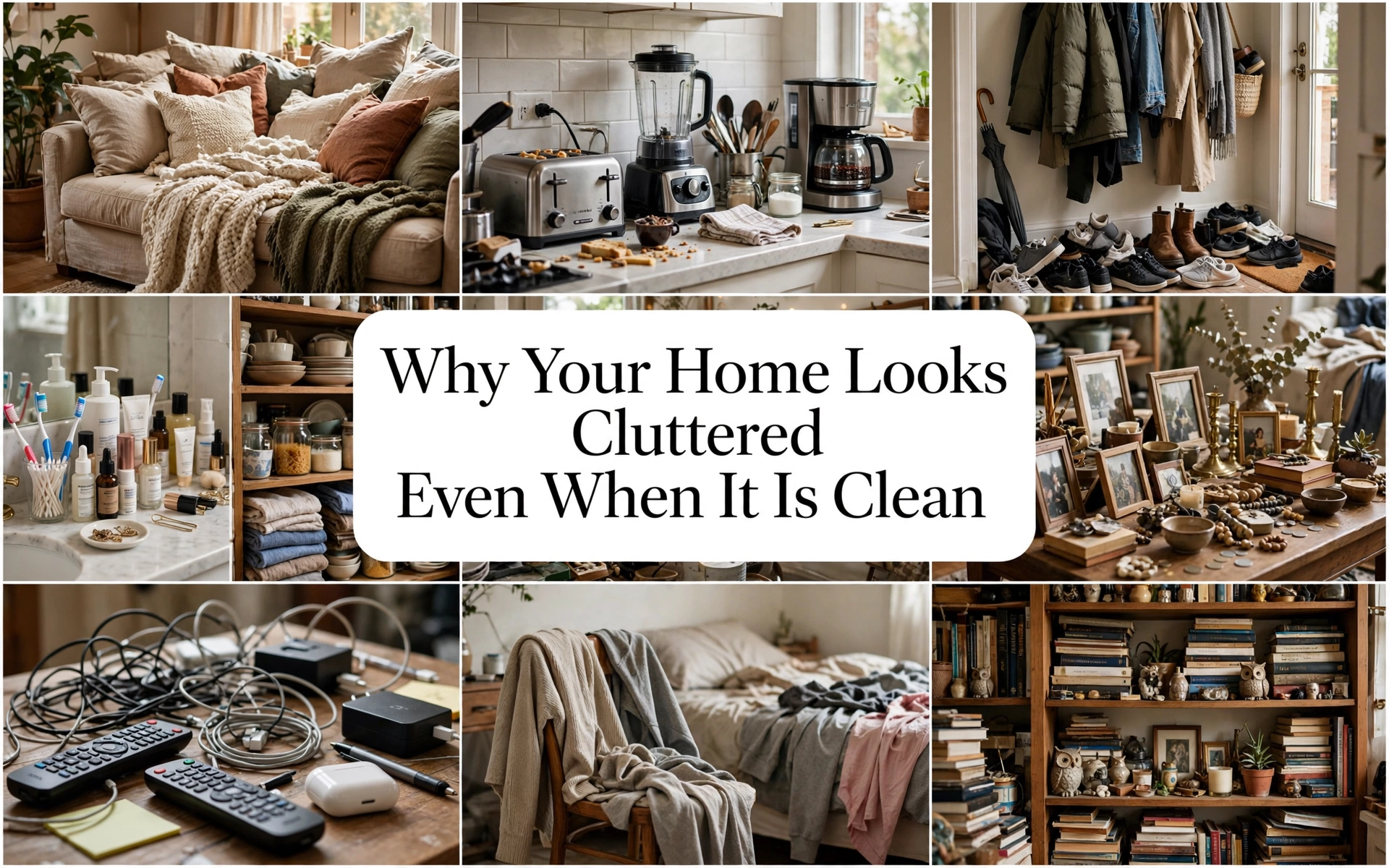
Why Your Home Looks Cluttered Even When It Is Clean
You have wiped the counters, folded the blankets, vacuumed the floors, and returned every loose item to its place. Yet when you stand in the doorway, the room still looks unsettled.
This is not necessarily a cleaning problem. It may not even be a traditional decluttering problem.
A room can be spotless and organized while still presenting too many colors, edges, labels, objects, furniture legs, patterns, and competing focal points. Your brain registers all those separate signals before it recognizes how carefully you arranged them. The result is a room that feels busier than it is.
The encouraging part is that you may not need to throw away half your belongings. You need to make the room easier for the eye to understand.
Clean, Organized, and Visually Calm Are Different
Cleaning removes dust, stains, crumbs, and rubbish. Organizing assigns belongings a location. Visual editing decides what should be seen.
Imagine ten bottles lined up neatly on a bathroom counter. They are organized, but each bottle introduces a different shape, label, color, and height. Place the same products inside one drawer and leave a soap dispenser beside the sink, and the bathroom immediately looks calmer.
That difference explains why you can work hard all morning and still feel dissatisfied. You solved cleanliness but not visual competition.
A visually calm home does not have to be sparse. It needs hierarchy: a clear focal point, supporting elements, repeated colors or materials, and enough quiet space around important pieces.
Designer Tip: Photograph a room from the doorway. A photograph flattens the space, making scattered objects, crooked lines, and competing colors easier to notice.
1. Too Many Small Objects Are Competing for Attention

Twenty small decorations usually look busier than three substantial pieces, even when both arrangements occupy the same amount of space. Every little frame, candle, figurine, planter, and souvenir creates another outline for the eye to process.
The solution is not automatically to discard meaningful belongings. Begin by consolidating them.
Group related objects into one visual story. Place several travel mementos inside a glass-front cabinet. Arrange family photographs in a deliberate gallery instead of distributing frames across five surfaces. Put three small bathroom products on a tray so they read as one unit.
This is especially helpful for collectors, sentimental decorators, and anyone who dislikes sterile minimalism.
How to recreate it: Remove every accessory from one surface. Return one larger object, one lower supporting element, and—if the surface permits—one small accent. Store the remaining pieces and rotate them seasonally.
Common Mistake: Replacing loose clutter with an equal number of small baskets. The room still contains the same number of visible shapes.
Budget Hack: Use a tray, shallow bowl, hardcover book, or wooden board you already own to visually connect small objects.
Luxury Upgrade: Commission shallow, internally illuminated display cabinetry. The collection remains visible, but repeated shelving and controlled lighting give it architectural order.
2. Every Surface Is Occupied

A home begins to feel crowded when the dining table, coffee table, kitchen counters, nightstands, dresser, console, and windowsills all carry something. None of the individual arrangements may be excessive, but their combined effect leaves no visual pause.
Negative space is not wasted space. It frames what you choose to display.
A useful starting point is to keep at least one meaningful surface in each room completely clear. On larger surfaces, aim for roughly two-thirds open space rather than decorating every available inch. This is a flexible design guideline, not a mathematical rule.
For a busy family, the kitchen island may be the most valuable clear surface. In a studio apartment, it might be the dining table. Choose the area whose emptiness will create the greatest sense of relief.
How to recreate it: Clear one surface fully. Live with it empty for 24 hours. Add back only what supports the surface’s purpose.
Common Mistake: Styling every surface independently. A coffee table, mantel, console, and shelf can each look attractive up close but chaotic when viewed together.
Budget Hack: Empty first. Buying containers before reducing what is visible often adds objects instead of creating calm.
Luxury Upgrade: Choose a statement surface—beautiful veined stone, solid timber, limewash, or lacquer—that looks complete without being covered in decoration.
Designer Tip: Clear space is most powerful around the room’s best feature. Give artwork, a fireplace, or a sculptural chair room to breathe.
3. Open Storage Is Exposing Too Much

Open shelves are beautiful in photographs because they are styled like compositions. In real homes, they often hold cereal boxes, tangled chargers, children’s games, paperbacks, medicine, receipts, and objects of unrelated sizes.
Open storage works best for attractive items used often or for a tightly edited collection. Closed storage works better for visually inconsistent necessities.
If you want open shelving, control at least two variables:
- Repeat a limited palette.
- Leave intentional gaps.
- Group books by height or category.
- Use only one or two container styles.
- Keep unattractive supplies below eye level.
- Avoid pushing objects to every front edge.
Renters can introduce concealment without installing cabinetry. Matching opaque boxes, a curtain fitted beneath a console, or a tall freestanding cabinet can produce a dramatic change.
Common Mistake: Filling every shelf because empty shelf space feels unfinished. Empty space is part of the arrangement.
Budget Hack: Cover sturdy boxes in matching paper or fabric. Use identical labels placed in the same position.
Luxury Upgrade: Replace a mixture of freestanding units with floor-to-ceiling cabinetry painted the wall color. Flush doors reduce visible boundaries and make storage feel architectural.
4. Your Palette Contains Too Many Interruptions

A room does not need to be beige to feel calm. Color becomes cluttered when it appears as isolated, unrelated moments: one red cushion, a blue storage bin, bright product packaging, a multicolored rug, several wood tones, chrome hardware, black frames, and warm brass lighting.
Cohesion comes through repetition. Select a dominant neutral or background tone, one secondary family, and one or two accents. Then repeat them across the room.
For example:
- Warm white walls
- Walnut and tan as the secondary family
- Olive green as the accent
- A small amount of aged brass for contrast
Colorful homes can use the same principle. A maximalist room feels deliberate when its colors recur in the rug, art, textiles, and books. Random color is noisy; repeated color creates rhythm.
How to recreate it: Identify the three colors already dominating the room. Remove or relocate objects that introduce isolated colors without contributing enough beauty or function.
Common Mistake: Buying matching sets in an attempt to create cohesion. Exact matching can feel flat; coordinated undertones feel more sophisticated.
Budget Hack: Change cushion covers, consolidate colorful packaging, and paint mismatched frames one finish before replacing large furniture.
Luxury Upgrade: Repeat a custom color across millwork, upholstery piping, lampshades, and a commissioned artwork for an exceptionally resolved scheme.
Styling Secret: Matching undertones matters as much as matching colors. Creamy white, orange oak, and warm brass cooperate; icy white and blue-gray may make that same oak look disconnected.
5. Furniture Scale and Layout Are Fragmenting the Room

Too many undersized pieces can make a room look more cluttered than fewer generous pieces. Four small side tables, two narrow rugs, several tiny chairs, and a lightweight media stand produce many separate edges without anchoring the space.
Furniture should relate to both the architecture and the other pieces around it.
A properly sized rug unifies a seating group. A substantial console visually anchors a wall. One long storage cabinet creates a cleaner silhouette than several unrelated cubes. Furniture with consistent leg or base treatments also reduces fragmentation.
For small rooms, this does not mean buying enormous furniture. It means selecting fewer pieces with more useful capacity.
How to recreate it: Draw the room and mark every furniture footprint. Look for duplicated functions. Could one wide cabinet replace a side table and storage cart? Could one large rug connect the entire seating arrangement?
Common Mistake: Pushing every item against the wall. This creates a disconnected ring around an empty center and can weaken the room’s focal point.
Budget Hack: Remove one redundant piece before purchasing anything. Connect remaining furniture with one correctly positioned rug.
Luxury Upgrade: Use custom millwork or built-ins to absorb media equipment, shelving, cables, and secondary storage into a single architectural element.
6. Packaging, Labels, and Cords Are Becoming Decor

Some of the strongest clutter signals are not belongings but branding: dish-soap labels, snack packets, cleaning bottles, tissue boxes, cosmetics, charging cables, routers, extension cords, and appliance wires.
Because packaging is designed to attract attention in a store, it naturally introduces high-contrast colors and typography into a room.
Decant only where it improves daily life and remains safe. Dry pantry staples can be transferred to labeled airtight containers. Cleaning products and medicines should retain safety information or remain in their original containers behind closed doors. Never place hazardous products in misleading drink or food containers.
Cords can be shortened, routed behind furniture, clipped beneath a desk, or grouped inside a ventilated cable-management box.
Common Mistake: Decanting everything for appearance and losing expiry dates, preparation instructions, or safety information.
Budget Hack: Turn bottles so their labels face away from the room. Use reusable hook-and-loop straps to bundle excess cable length.
Luxury Upgrade: Add outlets inside drawers and cabinets for charging, with professionally planned ventilation and electrical installation.
7. Your Walls Lack Visual Hierarchy

A wall covered with several unrelated small pictures can feel like a noticeboard. Conversely, many tiny pieces scattered across several walls make the whole room feel restless.
Wall decor needs a relationship to the furniture beneath it.
Above a sofa, one large artwork or a tightly composed gallery usually creates more calm than three small pictures floating too high. When creating a gallery wall, repeat frame colors, maintain deliberate spacing, and treat the entire arrangement as one large rectangle.
Curtains can also create visual clutter when they are too short, narrow, heavily patterned, or hung at inconsistent heights. Full-length panels positioned higher and wider than the window generally produce cleaner vertical lines.
How to recreate it: Remove wall art that is not visually connected to nearby furniture. Mock up the proposed arrangement with paper before driving nails.
Budget Hack: Combine printable art, family photography, and thrifted frames painted one consistent finish.
Luxury Upgrade: Commission one properly scaled work or use custom framing with generous mounts. Scale often looks more luxurious than quantity.
Designer Tip: If the wall arrangement looks like several separate items from across the room, tighten the spacing until it reads as one composition.
8. The Room Has No Dominant Focal Point

When the television, fireplace, gallery wall, patterned rug, bright sofa, chandelier, and crowded bookcase all demand attention, the eye does not know where to land.
Choose one primary focal point. Let other attractive features support it instead of competing with it.
In a living room, that might be the fireplace. In a bedroom, it is usually the bed. In a dining room, it may be the table and pendant. In a kitchen, it could be the range wall or island.
Strengthen the focal point through scale, lighting, color, or placement. Quiet the surrounding areas.
Common Mistake: Making every purchase a statement piece. A room composed entirely of stars has no supporting cast.
Budget Hack: Rearrange existing furniture so its orientation reinforces the best architectural or decorative feature.
Luxury Upgrade: Add restrained architectural framing—panel molding, built-in shelving, stone, or specialty plaster—around the focal feature.
9. Your Storage System Does Not Match Your Habits

If shoes always accumulate by the door, the problem may not be laziness. The shoe storage may be too far away, too small, or awkward to use.
Successful storage meets belongings at the point where people naturally drop them:
- A shallow tray where keys land
- Hooks where bags are removed
- A lidded hamper where clothes are changed
- A recycling slot where mail is opened
- A basket beside the stairs for items moving between floors
- A charging drawer near the usual sitting area
Design around real behavior, not ideal behavior. An open hook used daily is better than a perfect hanger system nobody follows.
How to recreate it: Observe one recurring pile for a week. Identify who creates it, what the items are, and what action would require the least effort.
Common Mistake: Creating elaborate categories. If putting something away involves opening three containers, the system will fail during a busy week.
Budget Hack: Relocate an existing basket or hook before buying another organizer.
Luxury Upgrade: Add concealed drop zones with shallow drawers, integrated charging, adjustable shelving, and washable cabinet interiors.
10. Lighting Is Amplifying the Visual Noise

One harsh ceiling light illuminates every object with equal importance. It can flatten a room and emphasize open shelving, glossy packaging, uneven surfaces, and cables.
Layered lighting establishes hierarchy:
- Ambient lighting provides general illumination.
- Task lighting supports reading, cooking, and working.
- Accent lighting emphasizes art or architecture.
Warm, coordinated light temperatures generally create a more cohesive residential atmosphere than a mixture of stark white and yellow bulbs. The correct temperature depends on the room and existing finishes, but consistency within the visible space matters.
How to recreate it: Turn off the main ceiling light and introduce two or three pools of light at different heights. Notice which clutter disappears and which focal points become clearer.
Common Mistake: Adding numerous small decorative lamps to a room already crowded with objects.
Budget Hack: Standardize visible bulb color, change oversized lampshades, and conceal loose cords.
Luxury Upgrade: Install dimmable architectural lighting with separate circuits for ambient, task, and accent layers.
11. Your Home Has Too Many Unrelated Materials

A room may contain oak, gray laminate, glossy white plastic, chrome, black metal, rattan, marble print, and brass—all clean, but visually disconnected.
Repetition allows different objects to belong together. Repeat a wood tone, metal finish, line, shape, or texture at least two or three times.
A black curtain rod can connect with black picture frames and a black lamp base. A rounded coffee table can echo an arched mirror and curved chair. Repetition creates a path the eye can follow.
This works particularly well for people decorating slowly with secondhand finds. Your pieces do not need to match; they need a shared visual thread.
Budget Hack: Paint or wrap a few small mismatched elements rather than replacing furniture.
Luxury Upgrade: Create a whole-home material palette specifying consistent wood undertones, metals, stone, paint, and textile families.
12. You May Simply Own More Than the Home Can Support

Design techniques can reduce visual noise, but they cannot create unlimited capacity. If drawers cannot close, cabinets require constant reshuffling, and every hidden space is full, the home has a volume problem.
The goal is not to eliminate personality. It is to give every retained object enough room to be used, stored, and returned without friction.
Use a capacity rule: choose the container first, then keep only what fits comfortably. One shelf for board games. One cabinet for mugs. One basket for blankets. The physical boundary makes the decision clearer.
If you are sentimental, photograph items before releasing them, create one memory box per person, or rotate meaningful decor instead of displaying all of it simultaneously.
Common Mistake: Buying more storage for objects you do not use. This can reduce floor space while preserving the original problem.
Budget Hack: Sell duplicates and use the proceeds to improve storage for the belongings that remain.
Luxury Upgrade: Invest in tailored storage only after editing your possessions. Custom cabinetry should support your life, not permanently preserve unnecessary objects.
Can Maximalist Homes Still Feel Uncluttered?
Absolutely. Maximalism and clutter are not synonyms.
Successful maximalist rooms use repetition, hierarchy, deliberate collections, balanced scale, and moments of visual rest. Colors recur. Collections are grouped. Art follows a compositional structure. Large patterns balance small details.
The maximalist room tells a layered story. A cluttered room presents many unfinished sentences.
To create calmer maximalism:
- Repeat three to five principal colors.
- Group collections instead of scattering them.
- Use one dominant pattern and quieter supporting patterns.
- Maintain clear walking paths.
- Keep practical packaging out of sight.
- Leave some areas less decorated.
- Use substantial furniture to anchor small objects.
Styling Secret: Maximalism looks intentional when abundance is concentrated. A fully layered bookcase beside a quiet wall feels richer than small decorations scattered throughout the room.
Room-by-Room Visual Clutter Reset
Entryway
Keep the floor as clear as possible. Provide one landing place for keys, one system for shoes, and one hook or compartment per regular user.
Remove promotional flyers, unused bags, out-of-season footwear, and multiple tiny containers.
Living room
Anchor the seating with a properly sized rug. Consolidate remote controls, reduce undersized accessories, hide cables, and choose one focal point.
Keep at least one table or section of a table mostly clear.
Kitchen
Remove appliances not used several times a week. Group cooking essentials near the range, place dishwashing supplies near the sink, and conceal backup products.
The goal is not an empty kitchen; it is a kitchen whose visible items explain how the space is used.
Bedroom
Make the bed the focal point. Give partially worn clothes a dedicated hook or basket. Keep the nightstand edited and remove furniture that has become a dumping surface.
Use calm bedding as a large visual field that balances smaller personal items.
Bathroom
Limit visible products to daily necessities. Group them on one tray or place them in a shallow drawer. Use one towel color family and contain backup supplies.
Home office
Manage cables first. Then reduce paperwork, duplicate stationery, and desktop accessories. Create one inbox for unprocessed papers rather than multiple “temporary” piles.
Children’s spaces
Use broad categories children can maintain: blocks, art, vehicles, soft toys. Picture labels help younger children. Rotate toys so every item does not compete for attention simultaneously.
The One-Hour Visual Calm Reset
If the entire house feels overwhelming, begin with the room you see most often.
Minutes 0–10: Photograph and observe
Take doorway photographs. Identify the three areas producing the most visual noise.
Minutes 10–20: Clear one important surface
Remove everything. Return only what supports its actual function.
Minutes 20–30: Consolidate small items
Group loose objects on trays, inside drawers, or within one coordinated container.
Minutes 30–40: Remove artificial color noise
Hide packaging, bags, visible supplies, tangled cords, and temporary paperwork.
Minutes 40–50: Correct the focal point
Reorient furniture or reduce competing decorations around the room’s best feature.
Minutes 50–60: Add breathing room
Leave one shelf section, wall area, or tabletop intentionally empty. Take another photograph and compare.
Do not attempt to finish the whole house. A visibly calmer room creates proof that the process works—and makes the next room easier.
STEP 8: Frequently Asked Questions
1. Why does my home look cluttered even though everything is put away?
Your home may contain too many visible colors, outlines, patterns, furniture pieces, labels, or decorative groups. Organization determines where objects belong; visual editing determines how many competing elements remain visible.
2. What is visual clutter?
Visual clutter is an excess of competing information within your field of view. In a home, it can come from crowded surfaces, open storage, packaging, cords, contrasting colors, small decor, busy patterns, or furniture that fragments the room.
3. How can I quickly make my house look less cluttered?
Clear one major surface, remove items from the floor, hide packaging, group small objects on trays, manage cords, and create one focal point. These changes reduce visible competition without requiring a complete declutter.
4. Can a clean house still look messy?
Yes. Cleaning removes dirt but does not resolve poor scale, crowded surfaces, inconsistent colors, exposed storage, awkward furniture placement, or excessive decorative detail.
5. What colors make a home look less cluttered?
No single color guarantees calm. A limited, repeated palette is more important. Coordinated neutrals, consistent undertones, and one or two repeated accents make objects feel related and reduce visual fragmentation.
6. Does open shelving make a room look cluttered?
Open shelving can look cluttered when it is completely full or holds unrelated packaging and small objects. Combine concealed lower storage with edited displays, repeated colors, deliberate grouping, and empty shelf space.
7. How much decor should be on a surface?
Display enough to create one intentional composition while leaving most of the surface usable. On many tables or consoles, approximately two-thirds open space is a helpful starting point, but scale and function should guide the final arrangement.
8. How do I reduce clutter without becoming minimalist?
Keep meaningful belongings, but group collections, rotate displays, repeat colors, use larger accessories, and conceal unattractive necessities. The goal is clearer hierarchy—not an empty home.
9. Why do storage baskets still make my room look cluttered?
Too many baskets introduce additional shapes, textures, and labels. Baskets may also become unedited dumping zones. Use fewer, larger containers in consistent materials and give each a defined category.
10. What makes a small room look especially cluttered?
Too many small furniture pieces, undersized rugs, blocked walkways, visible floor storage, high-contrast colors, crowded surfaces, and insufficient closed storage can fragment a small room.
11. Should every item have a designated home?
Frequently used items should have a convenient, clearly defined home near where they are used. The location must be easy enough that household members can return the item consistently.
12. How do I make family clutter easier to control?
Design systems around existing habits. Place hooks where bags are dropped, hampers where clothes are changed, shoe storage by the entrance, and toy bins near play areas. Use broad categories rather than complicated sorting.
13. Can too much furniture make a clean room look cluttered?
Yes. Excess furniture reduces visible floor area, interrupts circulation, and creates additional edges. Removing one redundant piece or replacing several small pieces with one useful storage item can make the room feel calmer.
14. How can renters hide visual clutter?
Renters can use freestanding cabinets, matching opaque boxes, furniture with drawers, under-bed storage, cord covers, removable hooks, fabric panels, coordinated curtains, and temporary wallpaper inside open shelving.
15. What should I declutter first when everything feels overwhelming?
Begin with the first room seen when entering your home or the room used most often. Clear one prominent surface, remove objects from the floor, and eliminate visible packaging. A contained visual win creates momentum without exhausting you.
Conclusion
Imagine entering your home tomorrow and noticing the room itself before noticing the objects inside it. The light reaches the surfaces. The furniture feels anchored. Your favorite artwork finally holds attention because it is no longer competing with cables, packaging, and a dozen smaller decorations.
Nothing feels stripped of personality. The books, photographs, textiles, and souvenirs that tell your story are still present—but now they have space to be appreciated.
Begin with one doorway photograph and one surface. Remove what interrupts the view, group what belongs together, and leave a little more room than feels natural at first. Then walk away and return later.
That first breath of visual quiet will show you what the rest of your home can become: not an immaculate showroom, but a warm, functional place that welcomes your eyes and settles your mind.