
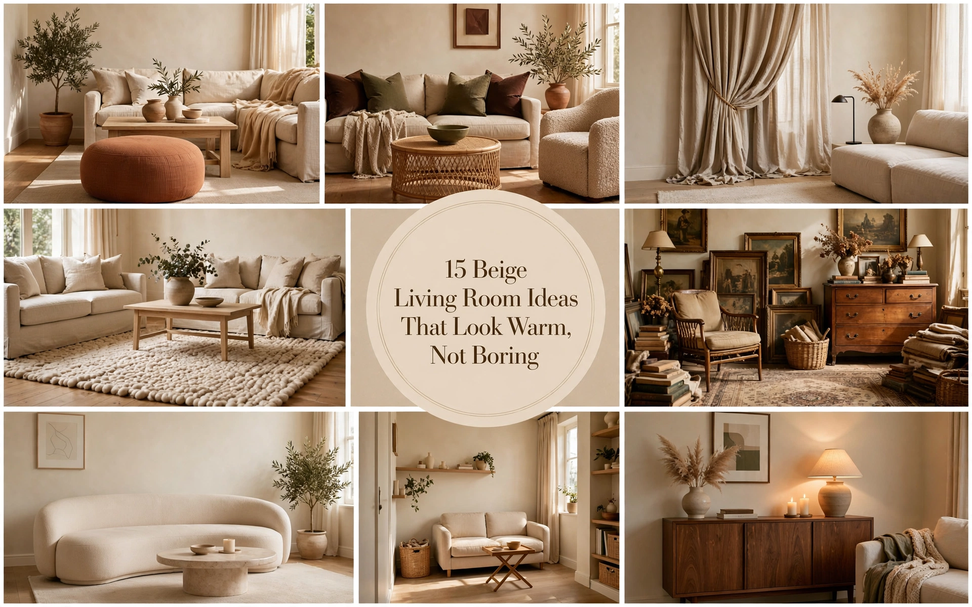
15 Beige Living Room Ideas That Look Warm, Not Boring
A beige living room can go from serene to seriously dull with one wrong undertone—or one too many matching surfaces.
The good news? You probably don’t need to replace everything. These beige living room ideas will show you exactly how to add depth, warmth, and personality, starting with the changes that make the biggest difference.
1. Start With the Right Beige Undertone

If beige paint looks peachy, gray, or strangely yellow in your room, the color may not be bad—it may simply be fighting the light.
South-facing rooms can usually handle cooler taupe or greige. North-facing rooms need warmer shades with cream, sand, or subtle golden undertones. Compare samples beside your flooring, sofa, and curtains rather than against a blank white wall.
This approach is ideal for anyone painting from scratch or wondering why an existing neutral scheme feels “off.”
How to recreate it
- Paint large sample boards rather than tiny wall patches.
- Move them around the room during morning, afternoon, and evening.
- Compare the beige with fixed finishes such as flooring and stone.
- Check the color under your lamps as well as daylight.
- Choose a shade that relates to the room’s existing warm or cool undertones.
Designer Tip: A good beige should make your flooring look richer. If it makes wood appear orange or gray carpet look dirty, keep sampling.
Common Mistake: Choosing paint beneath bright store lighting and ordering it immediately.
Budget Hack: Buy sample pots and paint pieces of lining paper or foam board.
Luxury Upgrade: Use mineral, clay, or limewash paint for natural movement and softly shifting color.
2. Layer Three Different Shades of Beige

The fastest route to a flat room is using the same beige on the walls, sofa, rug, and curtains.
Instead, think in values: one pale beige, one mid-tone beige, and one deeper mushroom or taupe. The eye reads the differences as depth even though the room still feels quiet.
This is perfect for neutral lovers who don’t want obvious accent colors.
How to recreate it
Try this simple palette:
- Light: ivory or pale oatmeal walls
- Medium: sand-colored upholstery
- Deep: mushroom, camel, or taupe accents
Repeat each shade at least twice. For example, connect a camel chair to camel piping on a cushion, or repeat the curtains’ taupe in a ceramic vase.
Designer Tip: Photograph the room in black and white. If everything becomes one indistinguishable gray, you need more tonal contrast.
Common Mistake: Buying a matching beige furniture set. Coordination is useful; perfect matching makes a room feel staged.
Budget Hack: Add a deeper throw, two mushroom cushion covers, and dark beige lampshades.
Luxury Upgrade: Upholster an armchair or ottoman in caramel mohair, velvet, or nubby wool.
3. Add Warm Wood for Instant Depth

Beige becomes far more convincing when it sits beside something naturally irregular. Wood supplies grain, warmth, and contrast without disrupting the calm palette.
Use pale oak for an airy Scandinavian mood, medium walnut for sophistication, or reclaimed wood for a relaxed rustic room. This works especially well in new homes that lack architectural character.
How to recreate it
- Bring in a substantial wooden coffee table.
- Repeat the wood tone in two smaller places.
- Combine clean-cut furniture with one organic shape.
- Let some grain remain visible instead of covering every surface.
Avoid mixing five unrelated orange, red, and gray wood finishes. Two compatible wood families are generally enough.
Designer Tip: Match undertones, not exact finishes. Honey oak and warm walnut can coexist because both lean warm.
Common Mistake: Adding numerous tiny rattan accessories when the room actually needs one visually substantial wooden piece.
Budget Hack: Look for a solid-wood table secondhand, then clean and oil it.
Luxury Upgrade: Choose a sculptural burl-wood cabinet or a handmade walnut coffee table.
4. Introduce One Dark Anchor

Every beige room benefits from something that gives the eye a place to land.
That anchor might be a black fireplace, dark wood sideboard, bronze coffee table, deep brown chair, or large framed artwork. It brings structure to pale colors and can make the lighter pieces look more intentional.
This technique is particularly effective in open-plan rooms and spaces with light flooring.
How to recreate it
Choose one substantial dark feature, then repeat its color in two or three smaller details:
- A dark wood console with matching picture frames
- A black fireplace with slim black lamp bases
- A chocolate chair with brown artwork and a small bowl
- A bronze table with aged-metal curtain hardware
Designer Tip: Aim for roughly 10% dark contrast. You need punctuation, not a second dominant palette.
Common Mistake: Scattering dozens of thin black accessories around the room. This can make a soft neutral scheme feel busy and harsh.
Budget Hack: Paint an existing side table or fireplace surround a deep espresso color.
Luxury Upgrade: Add dark stained joinery or a honed Nero Marquina stone fireplace.
5. Build Interest With Contrasting Textures

A successful neutral room should still be interesting when you mentally remove the color.
Pair rough with smooth, matte with reflective, and tightly woven fabric with something soft and irregular. Linen, wool, leather, wood, aged metal, stone, velvet, and ceramics each respond to light differently.
This is the best approach for an all-beige room that feels finished on paper but lifeless in person.
How to recreate it
Include at least three contrasting surfaces:
- Linen sofa
- Wool or jute-blend rug
- Smooth stone or wood table
- Velvet or leather accent
- Hand-thrown ceramic
- Aged brass or bronze light
Keep some visual breathing room. Texture loses its effect when every surface is covered.
Designer Tip: Put contrasting materials next to one another. A boucle chair is more beautiful beside smooth wood than beside five other fuzzy fabrics.
Common Mistake: Equating texture with piles of throws and cushions. Architectural texture and hard materials matter too.
Budget Hack: Add a linen-look curtain, vintage pottery, and one secondhand leather stool.
Luxury Upgrade: Install grasscloth, limewash, microcement, or a hand-finished plaster wall.
6. Pair Beige With Chocolate Brown

Chocolate brown gives beige the richness it often lacks. Because the two colors share earthy undertones, the contrast feels sophisticated rather than abrupt.
Use deep brown on upholstery, wood, curtains, or one painted architectural feature. It suits contemporary, mid-century, traditional, and rustic interiors equally well.
Current design guidance recommends pairing warm beiges with warm browns and creating enough light-dark contrast to keep the palette dimensional. Livingetc
How to recreate it
Try this reliable balance:
- 60% cream or pale beige
- 30% sand, camel, or natural wood
- 10% chocolate brown
A brown velvet chair, dark wood table, and narrow brown frame may be all you need.
Designer Tip: Include an off-white element so the scheme doesn’t become visually heavy.
Common Mistake: Using medium beige and medium brown exclusively. Add both a pale highlight and a dark note.
Budget Hack: Introduce chocolate through cushion covers, framed prints, and a thrifted table.
Luxury Upgrade: Choose a tobacco leather chair, brown mohair sofa, or walnut wall cabinetry.
7. Freshen Beige With Olive Green

Olive green adds life without destroying the restful mood. Its gray-brown undertones sit comfortably beside sand, oatmeal, camel, and warm wood.
This pairing is ideal for plant lovers and anyone who wants color but finds brighter hues overstimulating.
How to recreate it
- Start with one medium-size olive element.
- Repeat it in a smaller textile or piece of art.
- Add living greenery in varied leaf shapes.
- Support the palette with warm wood or aged brass.
For a softer scheme, use muted sage. For more drama, choose dark khaki or moss. Green and beige work particularly well for cozy, nature-connected rooms. Livingetc
Designer Tip: Treat plants as part of the composition. One tall, well-shaped plant usually has more impact than many tiny pots.
Common Mistake: Using cool mint against a yellow-heavy beige without testing the combination.
Budget Hack: Add olive cushion covers, clipped branches, and a painted secondhand side table.
Luxury Upgrade: Upholster a statement chair in moss velvet or install olive-painted built-ins.
8. Add Terracotta for Earthy Warmth

Terracotta brings warmth, energy, and a hint of Mediterranean character to beige. It is strong enough to wake up a neutral room but earthy enough to remain easy to live with.
It’s especially useful in rooms with warm sunlight, clay-colored brick, natural wood, or creamy beige walls.
How to recreate it
Introduce terracotta at three different scales:
- One noticeable piece, such as an ottoman
- Two smaller textiles
- One tiny decorative echo, such as a pot or artwork detail
Keep the rest quiet. Rust, clay, and burnt orange are related but don’t need to match exactly.
Designer Tip: Deep rust looks more sophisticated than bright orange in most beige interiors.
Common Mistake: Adding terracotta only through several identical cushions. Vary the object type and texture.
Budget Hack: Use a washed cotton throw, clay pots, and downloadable artwork.
Luxury Upgrade: Add a rust mohair chair, antique kilim, or handmade terracotta floor lamp.
9. Make a Beige Sofa Look Intentional

A beige sofa is an excellent anchor, but it can disappear when the wall, rug, and curtains are nearly identical.
Create separation around it. Give the sofa either a darker backdrop, a lighter rug, contrasting cushions, or a table with a strong silhouette. Beige sofas are flexible enough to accommodate expressive art and evolving color palettes, which is precisely why designers continue using them. Livingetc
How to recreate it
For a standard sofa, try:
- Two 22-inch or 55-centimeter cushions
- Two smaller contrasting cushions
- One lumbar cushion or casually folded throw
- Artwork spanning approximately two-thirds of the sofa’s width
- A coffee table that contrasts with the upholstery
Choose two cushion fabrics rather than six unrelated patterns.
Designer Tip: Leave some upholstery visible. A sofa buried beneath cushions looks smaller and less refined.
Common Mistake: Buying cushions that are too small. Generously scaled inserts create a fuller, more finished look.
Budget Hack: Keep existing inserts and change only the covers—provided the inserts still feel plump.
Luxury Upgrade: Add custom cushions with contrast piping and a handwoven wool throw.
10. Use Floor-to-Ceiling Curtains

Curtains that finish just above the window can visually shorten the room. Hanging them close to the ceiling creates height, softness, and a polished architectural frame.
This idea suits rentals, builder-grade rooms, and spaces with undersized windows.
How to recreate it
- Mount the rod close to the ceiling or below the crown molding.
- Extend it beyond each side of the window.
- Use enough fabric to look full when closed.
- Let the panels kiss the floor or break very slightly.
- Choose a beige that differs visibly from the wall.
Linen-look fabric filters daylight beautifully, while lined fabric produces a fuller, more formal drape.
Designer Tip: If the wall is warm beige, try ivory, flax, or mushroom curtains—not an almost-match.
Common Mistake: Hanging narrow panels that cannot close across the window.
Budget Hack: Use ready-made extra-long curtains and have them hemmed.
Luxury Upgrade: Install ceiling-mounted, pinch-pleat drapery with concealed tracks and weighted hems.
11. Choose a Rug That Grounds the Room

A rug that floats between the furniture makes a living room feel disconnected, no matter how beautiful its colors are.
At minimum, the front legs of the sofa and chairs should rest on the rug. In a large room, placing all furniture legs on it creates a more luxurious, unified seating zone.
How to recreate it
Before ordering, outline the proposed rug with painter’s tape.
Common starting points include:
- Small room: 5 x 8 feet, if the layout genuinely fits
- Average seating area: 8 x 10 feet
- Large living room: 9 x 12 feet or larger
Choose a rug lighter or darker than the sofa so their edges remain visible. A restrained pattern is useful in family rooms because it disguises everyday wear.
Designer Tip: Bigger is usually better, but preserve a consistent border of visible flooring.
Common Mistake: Centering a tiny rug beneath only the coffee table.
Budget Hack: Layer a smaller vintage or patterned rug over a large, affordable natural-fiber base.
Luxury Upgrade: Commission a hand-knotted wool rug sized precisely to the seating area.
12. Add Character With Vintage Pieces

A room furnished entirely from one current collection can look new but oddly anonymous.
Vintage objects introduce patina, irregularity, and a sense of history. In a beige room, even one aged wooden cabinet, timeworn stool, or unusual lamp can become the piece that gives everything else credibility.
This method suits renters and anyone slowly building a collected home.
How to recreate it
Choose vintage pieces that are useful as well as decorative:
- Side table
- Reading chair
- Wooden chest
- Table lamp
- Framed textile
- Ceramic vessel
- Small cabinet
Limit yourself to one or two obvious statement pieces per sightline.
Designer Tip: Look for beautiful shape and material before worrying about provenance.
Common Mistake: Buying numerous small “vintage-look” accessories that create clutter without adding genuine character.
Budget Hack: Search local marketplaces for solid wood, stone, pottery, and unusual lamps.
Luxury Upgrade: Source an antique case piece or collectible twentieth-century lounge chair.
13. Create a Softer Modern Minimalist Room

Minimalist beige rooms work when the simplicity feels deliberate, not empty.
Use fewer pieces, but give each one a strong silhouette. Curved furniture, oversized lighting, thick upholstery, and textured walls keep the space quiet while preventing it from feeling sterile.
How to recreate it
- Select one curved or sculptural seating piece.
- Use an oversized pendant or floor lamp.
- Hide practical clutter in closed storage.
- Keep surfaces mostly clear.
- Add one large piece of art rather than a gallery of small frames.
- Include both hard and soft natural materials.
Designer Tip: Minimalism requires scale. Five timid objects rarely have the presence of one beautiful oversized piece.
Common Mistake: Removing color, pattern, texture, and personality simultaneously.
Budget Hack: Declutter first, rearrange furniture, then add one large paper pendant and oversized thrifted artwork.
Luxury Upgrade: Invest in plaster walls, concealed joinery, sculptural seating, and integrated architectural lighting.
14. Make a Small Beige Living Room Feel Larger

Beige can visually open a small room, but pale color alone will not fix bulky furniture or a fragmented layout.
Choose pieces raised on legs, preserve clear walkways, and use fewer—but better-scaled—items. Let one floor treatment and one wall color run uninterrupted wherever possible.
How to recreate it
- Use a sofa with visible legs and relatively slim arms.
- Choose nesting tables instead of several permanent surfaces.
- Hang curtains beyond the window frame.
- Mount wall lights to free side-table space.
- Add a large mirror where it can reflect light, artwork, or greenery.
- Choose closed storage that reaches upward rather than outward.
Designer Tip: A small room can handle one large sofa better than a collection of undersized chairs.
Common Mistake: Pushing every piece against a wall. Even a small gap can make the layout feel more considered.
Budget Hack: Replace a bulky coffee table with two movable nesting tables.
Luxury Upgrade: Install shallow, wall-to-wall cabinetry painted the same beige as the walls.
15. Fix a Dark or North-Facing Beige Room

In weak daylight, a pale beige can become dull and shadowy rather than bright. Trying to force the room to look sunny with an even paler color often makes matters worse.
Embrace a warmer, slightly deeper neutral—mushroom, putty, caramel, or warm taupe—then add layered artificial lighting. This creates an intentional cocoon instead of a room perpetually waiting for sunlight.
How to recreate it
Use at least three light sources:
- Ambient ceiling or wall lighting
- A floor lamp near the seating area
- A table lamp at a lower level
- Optional picture lights or shelf lighting
Choose bulbs with compatible color temperatures, generally around 2700K for a warm residential atmosphere. Test the effect before purchasing multiple bulbs.
Designer Tip: Light the walls and corners, not just the middle of the floor. Vertical illumination makes a room feel more generous.
Common Mistake: Using one bright, cool overhead light to compensate for poor daylight.
Budget Hack: Add plug-in wall sconces and warm-shaded table lamps at different heights.
Luxury Upgrade: Install dimmable architectural lighting, picture lights, and concealed joinery illumination.
Conclusion
Picture the room at the end of the day: the curtains falling in soft folds, lamps warming the walls, the grain of a wooden table visible beside the sofa, and one deep color giving the whole space focus.
It still feels peaceful—but now it feels unmistakably yours.
Start with the spot that bothers you most. Change the contrast, add one honest texture, and let the room come alive from there.
Frequently Asked Questions
Is beige still in style for living rooms?
Yes. Beige remains useful because it is warm, adaptable, and easy to update, but the strongest contemporary rooms combine it with richer brown, colored accents, natural materials, and visible texture. Flat, completely matching beige schemes tend to feel more dated than beige itself.
What colors go best with a beige living room?
Chocolate brown, olive green, rust, terracotta, burgundy, dusty pink, navy, black, and warm white all pair well with beige. Choose colors that share or deliberately complement your beige’s undertone.
How do I make a beige living room less boring?
Add tonal contrast, three or more distinct textures, one dark anchor, and something personal or vintage. You usually don’t need more decorative objects—you need stronger variation between the objects already there.
What color curtains work with beige walls?
Ivory, flax, oatmeal, mushroom, olive, chocolate, and muted rust can all work. Select curtains that are visibly lighter or darker than the wall so the window treatment does not disappear.
What color rug goes with a beige sofa?
Try ivory for a light tonal look, chocolate or gray-brown for depth, or a muted patterned rug containing rust, olive, navy, or burgundy. The rug should contrast enough for the sofa’s outline to remain visible.
Can beige and gray work together?
Yes, particularly when their undertones are compatible. Warm greige and mushroom shades bridge the two neutrals; warm wood, cream textiles, and brown accents prevent a beige-and-gray room from feeling cold.
How do I add color without losing the neutral look?
Use one muted accent color in three places and vary the scale. An olive chair, a small green detail in the artwork, and one patterned cushion will feel cohesive without overtaking the beige foundation.
What is the best beige for a dark living room?
A warm, slightly deeper beige often performs better than a very pale neutral. Test mushroom, putty, warm taupe, or caramel-beige samples under both daylight and evening lamps before deciding.
What furniture goes with beige walls?
Beige walls work with cream upholstery, brown leather, olive or rust velvet, oak, walnut, blackened metal, stone, and painted furniture. Prioritize varied silhouettes and materials rather than matching every item by color.
How can I make a beige living room look expensive?
Use fewer, larger pieces; hang full-length curtains; choose a properly sized rug; improve the lighting; and incorporate authentic materials such as wool, linen, wood, stone, and aged metal. Precise scale and thoughtful editing usually look more luxurious than excessive decoration.


