
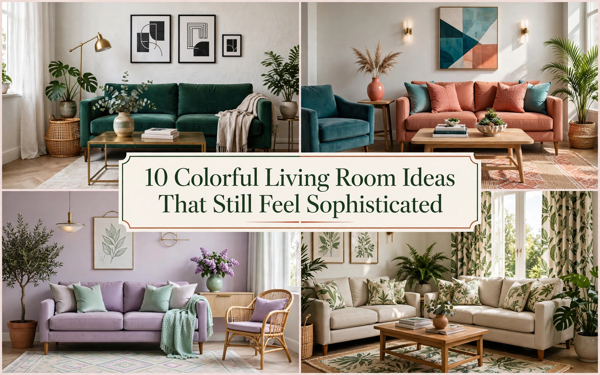
10 Colorful Living Room Ideas That Still Feel Sophisticated
A colorful living room can change the emotional temperature of an entire home. A yellow chair can make a dark morning feel lighter. A deep blue wall can turn an ordinary television corner into a cocoon. A faded red rug can make a collection of unrelated furniture suddenly feel as though it belongs together.
Yet many people who love colorful interiors hesitate when decorating their own rooms. They save rooms filled with emerald sofas, painted ceilings, and patterned curtains, then buy another beige cushion because beige feels safer. The fear is understandable: color is noticeable, paint can be inconvenient to redo, and an unplanned combination can feel busier at home than it appeared on a small screen.
The answer is not to avoid color. It is to give color a structure.
The most successful colorful rooms rarely contain every color in equal amounts. They establish a visual hierarchy: one dominant family, one supporting family, and smaller notes that lead the eye around the room. They repeat important hues, vary their intensity, and leave deliberate quiet areas. That is why a room can contain cobalt, coral, ochre, and green yet feel calmer than a gray room crowded with unrelated objects.
The following colorful living room ideas range from low-commitment textile changes to immersive paint treatments. Each one includes a practical route, a common mistake to avoid, an affordable approach, and a way to make the result feel more luxurious.
Before You Add Color, Build a Palette You Can Repeat
Start with something you already love and plan to keep: a rug, artwork, patterned chair, curtain fabric, or even the view outside your windows. Pull three colors from it. Choose one to occupy the largest area, one to support it, and one to appear in smaller accents. This is more reliable than selecting isolated paint chips because the starting object has already shown that the colors can coexist.
A useful guide is a flexible 60–30–10 balance: roughly 60 percent dominant color or quiet background, 30 percent supporting color, and 10 percent accent. Do not measure the room. Think in visual weight. A large cobalt sofa may count as much as several smaller blue objects, while a tiny scarlet lamp can command more attention than its physical size suggests.
Undertones matter as much as color names. A yellow-based cream sits naturally beside tomato red, olive, mustard, and rust. A cool white works more easily with cobalt, lilac, blue-green, and cherry red. If colors seem individually attractive but uncomfortable together, conflicting undertones may be the reason.
Test every important color at home during morning, afternoon, and lamplight. Paint large sample boards so you can move them behind the sofa, beside the curtains, and into darker corners. Fabric and rug samples should be viewed vertically and horizontally because light reaches them differently.
Designer Tip: Repeat every important accent at least twice, preferably three times, at different heights. A rust rug, rust artwork detail, and rust cushion form a quiet visual triangle that makes the choice feel intentional.
Budget Hack: Photograph your existing room in daylight and use a basic editing or mood-board app to place color swatches over the major surfaces before buying anything.
1. Begin With a Colorful Statement Sofa

A sofa occupies enough visual space to establish the room’s personality immediately. Velvet emerald, inky teal, paprika, saffron, raspberry, or cobalt can become the anchor around which quieter pieces gather. This works especially well when the architecture is simple or the walls must remain neutral.
Choose a color you have loved for years rather than the shade appearing most frequently in trend reports. Then make the sofa feel connected to the room by repeating its hue in two smaller places—perhaps a stripe in the rug and a detail in the artwork. Keep nearby large surfaces calmer so the sofa remains the clear lead rather than competing with equally intense curtains and walls.
Families should prioritize durable performance velvet, tightly woven upholstery, or removable covers. In small rooms, a colorful sofa with raised legs shows more floor and feels visually lighter than a low blocky silhouette.
Common Mistake: Buying bright upholstery from a tiny online swatch. Order the largest sample available and view it against the floor and wall at different times of day.
Budget Hack: Use a fitted washable slipcover or professionally tuck a heavy cotton cover over a sound secondhand sofa.
Luxury Upgrade: Choose contrast piping, a sculptural profile, or custom upholstery in a richly textured mohair or wool blend.
2. Let a Patterned Rug Write the Color Story

A multicolored rug is one of the easiest starting points because it places many hues in a controlled composition. Vintage-style Persian rugs bring muted reds, indigo, saffron, and cream; geometric flatweaves feel cleaner and more modern; painterly rugs suit contemporary spaces that need movement.
Select the rug before buying cushions and accessories. Pull the room’s largest furniture color from one of its quieter tones, not necessarily its brightest one. Reserve the strongest rug color for two or three small accents. This lets the rug connect the scheme without forcing every item to match.
Size matters. A small colorful rug can look like an isolated island and make the room feel fragmented. Ideally, at least the front legs of the main seating should rest on it. In an open-plan room, a correctly sized rug also defines the conversation area without adding walls.
Styling Secret: A rug containing slightly faded colors is more forgiving than one made from several equally pure brights. The softened tones make new and vintage furniture easier to combine.
Budget Hack: Layer a smaller vintage or washable patterned rug over a large inexpensive jute or neutral flatweave.
Luxury Upgrade: Choose a hand-knotted wool rug and use its least obvious hue on custom curtains for a sophisticated connection.
3. Paint One Wall a Deep, Confident Color

An accent wall is most convincing when it emphasizes something architectural: a fireplace, built-in shelves, the wall behind the sofa, or the far end of a long room. Deep teal, aubergine, burnt orange, brick red, and saturated blue add depth and make art and furniture feel more deliberate.
Before painting, ask why that wall deserves attention. Randomly coloring the easiest wall can upset the room’s balance. A good feature wall frames the focal point and is visible from the room’s main entrance. Paint electrical covers to match so small white rectangles do not interrupt the effect.
In a narrow room, a warm or dark color on the short end wall can visually bring it closer and improve proportions. In a small square room, a cool blue or green accent can create a sense of depth. Connect the wall to the rest of the room through textiles rather than trying to match the paint perfectly.
Common Mistake: Leaving every other surface stark builder white. A soft warm white or pale tint usually forms a gentler transition.
Budget Hack: One gallon—or less for a small wall—can transform the room. Spend time on preparation and clean edges rather than premium accessories.
Luxury Upgrade: Add matching painted molding or a limewash-like tonal finish for depth.
4. Use the Ceiling as the Fifth Color Surface

A painted ceiling adds surprise without taking up floor space. It can make a tall room feel more intimate, visually widen a small room, or connect colors already present in a rug and artwork. Sky blue feels airy, blush reflects warmth onto faces, terracotta creates a cocoon, and high-gloss navy can appear almost liquid in evening light.
For a gentle effect, choose a ceiling color related to the walls but several steps lighter. For drama, repeat a strong accent from below. Carrying the wall color onto the ceiling—color drenching—reduces visual boundaries and can make awkward architecture feel more coherent.
Pay attention to ceiling height and natural light. A very dark matte ceiling can feel heavy in a low, dim room, but a mid-tone or softly reflective finish may work beautifully. Always use paint formulated for ceilings where practical, and address cracks or uneven patches because color draws attention upward.
Designer Tip: Paint the crown molding with the ceiling rather than automatically leaving it white. This makes the treatment look intentional.
Budget Hack: Use leftover paint from another room if the hue already appears in your living room textiles.
Luxury Upgrade: Pair a lacquer-like ceiling with a sculptural pendant and a simple ceiling medallion.
5. Create a Gallery Wall That Connects the Palette

A gallery wall is a flexible way to introduce color because art can move, evolve, and include personal meaning. Combine paintings, prints, photographs, small textiles, and children’s art rather than buying a matching set. Cohesion can come from a repeated frame finish, consistent spacing, or three recurring colors across otherwise different works.
Lay the arrangement on the floor first. Begin with the largest piece slightly off center, then build outward while keeping gaps reasonably consistent. The overall shape should relate to the furniture below it; above a sofa, the collection generally feels grounded when it spans roughly two-thirds of the sofa’s width and hangs close enough to read as one composition.
If the room already contains bold upholstery, use artwork with breathing space. If the furniture is neutral, let the art carry more visual energy. Include one surprising dimensional item—a ceramic plate, woven basket, or tiny shelf—to prevent the wall from feeling like a catalog grid.
Common Mistake: Hanging art too high. The center of the complete arrangement should sit near average eye level, adjusted for the furniture beneath it.
Budget Hack: Frame postcards, bookplates, fabric remnants, calendar art, and your own photographs.
Luxury Upgrade: Add custom mats in one of the room’s secondary colors and use anti-reflective glazing for important pieces.
6. Layer Pillows in Different Colors and Pattern Scales

Pillows are popular because they are easy to change, but a pile of unrelated bright covers rarely creates the polished effect readers expect. Build a small textile family instead. Combine one large-scale pattern, one smaller geometric or stripe, and one or two solids with visible texture. Repeat at least one color across all of them.
Vary shape as well as pattern: a long lumbar cushion can calm a row of squares, while one round pillow softens angular seating. Leave enough empty sofa space for people to sit. A colorful living room should still function as a living room.
This approach is ideal for renters, cautious decorators, and homes where the palette changes seasonally. Warm rust, plum, and ochre can deepen a room in winter; leafy green, cornflower, and coral make it feel lighter in summer without replacing the main furniture.
Styling Secret: Match color temperature rather than exact shades. Several warm reds often look richer together than five objects in precisely the same commercial red.
Budget Hack: Sew envelope covers from remnant fabric, vintage tablecloths, or sturdy scarves.
Luxury Upgrade: Add one hand-blocked, embroidered, or tapestry cushion and use high-quality feather-and-down or resilient alternative inserts.
7. Pair Two Bold Colors and Give Them Breathing Room

Two-color schemes feel confident because the eye understands the relationship quickly. Blue and orange create lively complementary contrast; pink and green feel fresh and botanical; yellow and violet can be playful or regal; red and pale blue combine warmth with calm.
The secret is not using both colors at equal intensity everywhere. Let one dominate while the other punctuates. A navy room with a burnt-orange chair feels grounded; a bright orange room with equally bright blue furniture may feel restless. You can also soften one partner: tomato red becomes easier beside dusty blue than electric cyan.
Use wood, cream, stone, or black as a visual pause. These materials are not an apology for color; they give saturated pieces a readable silhouette. Repeat both colors in at least two zones so the scheme travels around the room instead of collecting on one side.
Designer Tip: Check a grayscale photo of the room. If every colorful object appears equally dark or light, vary the values to create depth.
Budget Hack: Keep expensive furniture neutral and establish the pairing through paint, curtains, art, and thrifted side tables.
Luxury Upgrade: Use one color in matte finishes and the other in velvet, lacquer, glass, or silk for material contrast.
8. Try Jewel Tones for Richness Without Neon Brightness

Emerald, sapphire, ruby, amethyst, garnet, and topaz deliver saturated color with enough depth to feel enveloping rather than fluorescent. They suit traditional, Art Deco, maximalist, and contemporary rooms, especially where evening entertaining matters.
Combine jewel tones that share similar depth, then include one grounding neutral such as espresso wood, warm ivory, charcoal, or aged brass. Emerald curtains, a sapphire chair, and a wine-colored rug can coexist when each shade feels equally complex. Natural materials prevent the palette from looking theatrical.
Jewel tones respond dramatically to light. Velvet absorbs and reflects light in different directions; glossy ceramics create highlights; brushed metal adds a restrained glow. Plan layered lighting with table lamps and sconces because these colors can flatten under one harsh ceiling fixture.
Common Mistake: Using several jewel tones only in tiny accessories. One substantial piece gives the smaller notes a reason to exist.
Budget Hack: Paint a thrifted cabinet in deep plum or forest green and change the hardware.
Luxury Upgrade: Add full-length velvet curtains mounted close to the ceiling and wide enough to form generous folds when closed.
9. Make Pastels Feel Modern With Strong Contrast

Pastels can be colorful without overstimulating a room, but they need contrast to avoid becoming sugary or nursery-like. Pair mint, powder blue, peach, butter yellow, or lilac with black, dark wood, oxblood, deep olive, or crisp architectural lines.
Choose pastels with gray, clay, or cream undertones for a more complex look. A chalky lilac wall behind a dark walnut console feels grown-up; mint upholstery becomes sharper beside a black floor lamp. Introduce irregular handmade textures—plaster, linen, wool, and ceramic—so the room does not look flat.
Pastels are particularly helpful in small or low-light living rooms because they reflect more light than deep saturated shades. They also create a gentle base for colorful art. Rather than scattering five pastels evenly, select two related shades and one darker anchor.
Styling Secret: A small note of rusty red or burgundy can give a pastel palette surprising depth.
Budget Hack: Transform plain lamps and frames with sample-size paint pots in two coordinated pastels.
Luxury Upgrade: Use limewash, hand-finished plaster, or custom linen curtains to add subtle tonal variation.
10. Bring in Color Through Curtains

Curtains cover a large vertical area, which makes them capable of changing the entire room without new furniture. Solid ochre linen warms cool gray walls; a blue botanical print energizes a white room; terracotta velvet adds weight and intimacy.
Mount the rod high and extend it beyond the window so open curtains reveal as much glass as possible. Full-length panels create an unbroken color column and make the ceiling appear taller. Fabric should be generous enough to form folds rather than hanging flat.
Patterned curtains work best when their background relates to the wall color or their motif repeats a hue from the rug. If the room already has a bold sofa, choose a smaller or softer curtain pattern. In rentals, curtains can conceal bland blinds and move to a future home if you use adjustable rods or carefully patched hardware.
Common Mistake: Choosing fabric from a small swatch without considering backlighting. Hold the sample against the window; sunlight can dramatically change its color and opacity.
Budget Hack: Add a contrasting fabric border to inexpensive plain curtains.
Luxury Upgrade: Use lined, pinch-pleated panels with a track mounted near the ceiling.
How to Keep a Colorful Living Room Cohesive

When a room feels chaotic, removing all its color is rarely necessary. Diagnose the specific problem.
First, look for repetition. If a bright object appears once, echo its color in a smaller detail elsewhere. Second, check visual weight. If every strong color occupies the same amount of space, choose one leader and reduce the others. Third, inspect pattern scale. Replace one of several similar-size patterns with a solid or a much larger motif.
Next, create pauses. Natural wood, cream, black, woven fiber, clear glass, and open wall space give the eye places to rest. Quiet materials do not make the room less colorful; they make the color more legible. Edit small accessories before replacing large purchases. Ten disconnected colorful objects usually create more noise than one colorful sofa or rug.
Finally, evaluate the room in the light in which you use it most. If evenings matter, switch on the lamps and turn off the overhead fixture. A palette that looks balanced at noon may need warmer bulbs or another low light source after sunset.
Designer Tip: Use the doorway test. Stand where you first see the room and identify the first, second, and third places your eye lands. If everything asks for attention at once, reduce contrast in one zone.
Frequently Asked Questions
How many colors should a living room have?
Most rooms are easiest to balance with three principal color families: a dominant color, a supporting color, and an accent. Each family can include lighter and darker versions, so the room may appear more varied without becoming disconnected. Neutrals, wood, metal, and greenery can support the palette without being counted rigidly.
What is the 60–30–10 rule for living room color?
The 60–30–10 rule suggests using a dominant color across roughly 60 percent of the room, a secondary color across 30 percent, and an accent across 10 percent. Treat it as a visual guide, not a mathematical requirement. A large dark sofa may carry more visual weight than its physical area suggests.
How can I make my living room colorful without painting?
Use a multicolored rug, curtains, artwork, lamps, cushions, throws, books, plants, and removable furniture covers. Begin with one patterned piece, pull two or three colors from it, and repeat those colors around the room. This creates cohesion without changing walls.
How do I make a colorful living room look sophisticated?
Limit the main palette, repeat important colors, vary color value, and leave visual breathing room. Combine saturated hues with natural wood, stone, linen, wool, or restrained neutrals. Sophistication comes from hierarchy and material quality, not from avoiding bright color.
What colors make a living room feel happy?
Warm yellow, coral, leafy green, sky blue, and clear pink often create an uplifting feeling, but personal associations matter. Choose colors that make you feel comfortable in your own light and climate. A muted version can deliver warmth without feeling overly stimulating.
Can I mix warm and cool colors?
Yes. A mix often gives a room depth. Let one temperature dominate and use the other as contrast—for example, cool blue walls with rust and walnut accents. Repeating a shared undertone or adding a bridging pattern helps the combination feel intentional.
How do I choose a colorful sofa I will not regret?
Choose a shade you have consistently liked, order a large fabric sample, and view it beside your wall, rug, and floor in changing light. Favor a durable material and a classic silhouette. Trend-driven color is less risky when the shape and construction have longevity.
Are colorful living rooms suitable for small spaces?
Absolutely. Small rooms can handle deep or bright color when the palette is controlled. Use one strong focal point, maintain clear walkways, choose appropriately scaled furniture, and repeat the color rather than scattering many unrelated accents. Tonal color drenching can even blur boundaries.
How can renters add color safely?
Focus on portable elements such as rugs, curtains, art, cushions, lamps, slipcovers, and painted furniture. Removable wallpaper may work if the wall finish and lease allow it; test a small hidden area first. Keep original hardware and document the room before making changes.
How do I mix colorful patterns?
Use one large-scale pattern, one medium pattern, and one small pattern. Repeat at least two colors across them and include solid surfaces nearby. Avoid combining several patterns with the same scale and density, because they compete for attention.
Should my curtains match my sofa?
They do not need to match. A better approach is to connect them through one shared hue, related undertones, or contrasting colors repeated elsewhere. Exact matching can make the room feel flat, while a thoughtful relationship creates depth.
Which neutral works best with bright colors?
The best neutral depends on undertone. Warm ivory, camel, and natural wood complement rust, coral, ochre, and olive. Crisp or cool white, charcoal, and blue-gray suit cobalt, lilac, cherry, and blue-green. Black can sharpen either palette in small doses.
How can I use red without overwhelming the room?
Choose one substantial or memorable red element and support it with quieter colors. Brick, oxblood, tomato, and berry each create a different mood. Repeat the red in two small details, keep nearby surfaces calmer, and test it under evening light.
What lighting is best for colorful interiors?
Layer ambient, task, and accent lighting instead of relying on one ceiling fixture. Warm-to-neutral bulbs often flatter skin, wood, reds, greens, and ochres, but always test bulbs in the room. Dimmers help saturated walls feel comfortable after dark.
What should I buy first for a colorful living room?
Start with the item that is hardest or most expensive to change, usually the sofa or rug, unless you already own it. If you are cautious, begin with a patterned rug or artwork that supplies a ready-made palette, then add paint and smaller objects after seeing the colors together.
Begin With the Color That Feels Most Like You
Imagine entering your living room and seeing something more personal than a collection of sensible purchases. Perhaps sunlight catches the blue in a worn rug. A raspberry chair waits beside the lamp where you actually read. The green of a painted cabinet repeats in a favorite landscape, while the rest of the room remains calm enough for those details to matter.
You do not need to transform everything in one weekend. Begin with the color you keep saving, wearing, or noticing. Bring home a sample, place it beside what you already own, and repeat it once. Then live with it. A room develops character through confident layers, not through one perfect shopping trip.
The most memorable colorful living rooms are not successful because they follow every rule. They are successful because their owners use structure to express something real. Give your favorite colors a hierarchy, a little breathing room, and a place in everyday life. The room will begin to feel less like an image you admired and more like a home that could belong only to you.


