
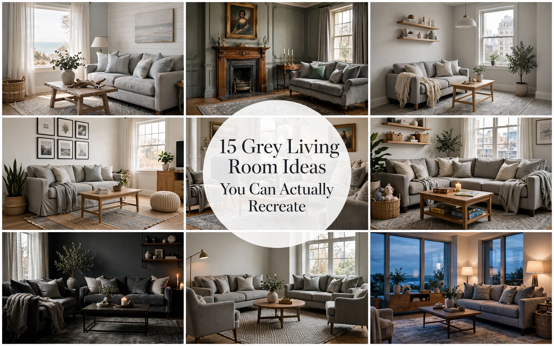
15 Grey Living Room Ideas for Every Style and Budget
There is a particular kind of disappointment that happens after you paint a living room grey. The sample looked elegant. The inspiration photo felt hushed and expensive. Yet in your own room, the walls suddenly seem blue, the sofa disappears into them, and every accessory looks as though it arrived separately.
That does not mean grey was the wrong choice. It means grey needs context.
I have watched the same soft grey behave like warm stone in a sunny room and like wet pavement in a shaded one. The difference was not the paint name; it was the light, flooring, wood tone, fabric, and contrast around it. The most inviting grey rooms are never simply “grey.” They are grey plus warmth, texture, rhythm, and evidence of a life being lived.
This guide gives you the eye of a designer without requiring a designer’s budget. You will learn how to diagnose undertones, choose a palette for your actual room, use one of 15 complete schemes, and correct the details that make a neutral room feel cold or unfinished. Save the rooms that make you feel something—but use the formulas to recreate them.
Before You Decorate: Find the Grey That Belongs in Your Room
The fastest route to a beautiful grey living room is not choosing a style. It is identifying what your room is already telling you. Daylight, flooring, fixed stone, and large furniture create a color temperature before you add a single cushion.
Read the undertone, not the paint name
Place a grey sample beside a sheet of plain white paper. Against white, its hidden bias becomes easier to see: violet, blue, green, beige, or brown. Then compare the sample with your floor and sofa. A blue-grey wall beside orange oak can look crisp and deliberate when there is a bridge—such as a blue-and-rust rug—but accidental when there is not.
Warm greys have beige, brown, or subtle violet undertones. They flatter cream upholstery, honey oak, walnut, brass, terracotta, and rooms used mostly in the evening. Cool greys lean blue or green. They work beautifully with crisp white, blackened steel, pale ash wood, navy, and abundant warm sunlight.
| DESIGNER TIP: Choose undertones by relationship, not in isolation. Carry a paint card to the sofa, rug, floor, fireplace, and curtains. The grey that harmonizes with the most expensive fixed finish usually wins. |
Let the window direction vote
North-facing rooms receive cooler, flatter light. Use a grey with visible warmth and avoid icy blue-greys unless you want a deliberately moody result. South-facing rooms can handle cooler or deeper greys because warm, consistent daylight softens them. East-facing rooms are warm in the morning and cooler after lunch; balanced greige or muted green-grey tends to transition gracefully. West-facing rooms grow golden late in the day, so test that your grey does not turn muddy or purple at sunset.
This matters because we experience a room across time, not as a still photograph. If you watch television at night, judge the color under evening lamps. If the room is your morning reading space, prioritize its 9 a.m. character.
Test paint like a designer

Paint two coats on movable boards at least 60 x 60 cm, rather than scattering small patches across different walls. Move the boards around the room for three days. View them beside the skirting, behind the sofa, near the window, and in the darkest corner. Turn on the lamps you will actually use.
| COMMON MISTAKE: Testing several greys directly beside one another. Each sample distorts the next. Leave generous wall space between samples or use separate boards. |
| BUDGET HACK: Use leftover lining paper, card, or inexpensive foam board instead of buying multiple sample pots for full walls. |
| LUXURY UPGRADE: Ask for a large-format hand-painted sample and commission a lighting consultation before choosing the final finish. A high-quality matte or mineral paint gives grey walls a softer, more dimensional response to light. |
The Five-Layer Formula That Keeps Grey from Feeling Flat
Every successful grey room contains five layers: value, temperature, texture, contrast, and life. Miss one and the room may still look tidy, but it will rarely feel magnetic.
1. Value: use light, middle, and dark
Value means how light or dark a color is. Aim for at least three values: perhaps pale grey walls, a mid-grey sofa, and charcoal frames. The eye reads those shifts as depth. If everything sits in the same middle-grey band, shapes blur together.
2. Temperature: add something unmistakably warm
Warmth can come from oak, walnut, cognac leather, aged brass, a cream rug, terracotta pottery, or lamps with 2700K bulbs. You do not need orange accessories everywhere. One substantial warm material is more convincing than ten tiny warm-colored objects.
3. Texture: mix surfaces that react differently to light
Combine at least one nubby textile, one smooth surface, one natural grain, and one soft drape. A boucle chair, honed stone table, oak cabinet, and linen curtain create movement even within a quiet palette. Texture is especially important in monochrome rooms because it replaces color contrast.
4. Contrast: define the room’s edges
Dark curtain rods, picture frames, a coffee table base, or a single charcoal chair can sharpen a pale grey scheme. In a dark room, reverse the logic with pale lampshades, light art, and a cream rug. Contrast gives the eye somewhere to land.
5. Life: include something irregular and personal

A grey room becomes a home when it contains organic shapes, books, collected art, branches, plants, or an object with history. These slightly imperfect elements interrupt the showroom effect and create emotional warmth.
| STYLING SECRET: Use the “one from each world” test: one textile, one natural material, one reflective finish, one living element, and one personal object in every major sightline. |
| BUDGET HACK: Before shopping, redistribute what you own. Move a wooden stool, woven basket, plant, stack of books, or ceramic bowl into the grey room. Often the missing layer is already elsewhere in the house. |
| LUXURY UPGRADE: Repeat one premium material three times at different scales—aged brass on a floor lamp, a tray, and a small frame, for example. Repetition makes luxury feel intentional rather than flashy. |
1. Warm Greige, Cream, and Oak: the universally welcoming room

This scheme works because it keeps contrast gentle while letting grain and fabric create depth. It is best for north-facing rooms, family homes, open plans, and anyone who wants calm without coolness. Choose greige walls, a cream or oatmeal sofa, mid-tone oak, and a rug that contains both grey and beige. Add charcoal only in fine lines—frames, a lamp stem, or a narrow table base.
Recreate it with a 60-30-10 balance: 60 percent warm grey, 30 percent cream and oak, 10 percent charcoal and muted green. Avoid using five slightly different beiges with no dark punctuation; the result can look hazy.
| BUDGET HACK: Replace a cool grey cushion cover with two oatmeal linen covers and place a warm wood tray on the coffee table. Those small swaps can rebalance an existing room. |
| LUXURY UPGRADE: Use limewash-style walls, full-length linen curtains, a hand-knotted wool rug, and one sculptural travertine side table. |
2. Dove Grey and Chalky White: quiet, airy, and precise

Dove grey feels restorative because it lowers visual noise. It suits small rooms, minimalists, and spaces with pretty architectural details. Keep walls pale grey, ceilings and trim a soft—not blue-white—white, and upholstery one shade deeper. Add pale ash or white oak so the room has a natural pulse.
Recreate it by limiting the palette but varying finish: matte walls, woven upholstery, gauzy curtains, and glossy ceramic. Avoid a brilliant white ceiling if the wall grey is warm; it can make the walls appear dirty.
| DESIGNER TIP: Match the white to the grey’s temperature. Warm grey wants ivory or chalk; cool grey can take a cleaner white. |
| LUXURY UPGRADE: Add tailored curtains on a ceiling-mounted track and an oversized paper or plaster pendant with a soft silhouette. |
3. Charcoal and Caramel Leather: sophisticated without stiffness

Charcoal gives a room intimacy; caramel leather supplies the visual heat. This pairing is ideal for media rooms, lofts, masculine-leaning schemes, and homes with brick or dark metal. Use charcoal on one architectural plane—the fireplace, joinery, or walls—then place cognac leather where natural light can catch its patina.
Recreate it with a cream rug beneath the seating, walnut rather than grey-washed wood, and warm lamps at three heights. Avoid combining charcoal walls, a charcoal sofa, black flooring, and black curtains without a large pale surface to release the visual pressure.
| BUDGET HACK: A vintage leather chair can provide enough warmth; the whole sofa need not be leather. |
| LUXURY UPGRADE: Choose aniline leather, fluted walnut cabinetry, smoked glass, and bronze hardware that will age rather than merely shine. |
4. Grey, Olive, and Walnut: grounded and quietly botanical

Olive and grey share a muted quality, so the combination feels peaceful rather than themed. Walnut deepens both colors. It is best for plant lovers, mid-century rooms, and spaces overlooking a garden. Let grey occupy the largest surfaces, use olive on an armchair, cushions, or curtains, and ground the room with walnut.
Recreate it by repeating olive at two scales and adding one lighter natural note such as cane, flax linen, or parchment. Avoid mixing blue-grey with a very yellow olive unless a patterned rug deliberately connects them.
| STYLING SECRET: Real leaves provide several greens at once, making a designed palette feel more relaxed. |
| BUDGET HACK: Use olive cushion covers and a thrifted dark-wood side table before committing to new upholstery. |
| LUXURY UPGRADE: Add a mohair olive chair, burl-wood box, and large original landscape with mossy, inky tones. |
5. Grey, Dusty Blue, and Linen: soft coastal calm without nautical props

Dusty blue extends grey’s calm while linen prevents it from feeling chilly. This works for sunny rooms, coastal homes, bedrooms that open into living spaces, and anyone who prefers low contrast. Choose a warm light-grey base, faded blue textiles, flax linen, weathered oak, and a small amount of off-white.
Recreate it with washed blue curtains or two substantial cushions rather than scattered blue trinkets. Add texture through woven blinds, a jute-wool rug, and handmade ceramics. Avoid anchors, shells, stripes, and distressed signs; material cues are more timeless than theme décor.
| BUDGET HACK: Dye or replace only the largest cushion covers and add a relaxed linen-look throw. |
| LUXURY UPGRADE: Use Belgian linen drapery, a pale blue mohair ottoman, honed limestone, and large-format seascape photography. |
6. Grey, Blush, and Burgundy: grown-up softness

Blush warms grey; burgundy prevents the pairing from becoming sugary. It is especially successful in apartments, elegant traditional rooms, and spaces with brass or dark timber. Keep blush dusty and restrained, then introduce burgundy in one confident moment: a velvet chair, patterned rug, or large artwork.
Recreate it with medium grey upholstery, plaster-pink textiles, oxblood accents, and antique brass. Avoid equal quantities of pink and grey, which can feel nursery-like. Grey should lead; blush should soften; burgundy should punctuate.
| DESIGNER TIP: If the room feels too sweet, add an angular black or dark-wood element. |
| BUDGET HACK: One burgundy cushion and a branch of deep red foliage can test the palette for a season. |
| LUXURY UPGRADE: Add silk-velvet upholstery, a veined marble table, and a vintage rug with faded wine tones. |
7. Grey, Rust, and Terracotta: the sunset palette

Rust is one of the most forgiving partners for grey because it supplies earthy contrast without looking loud. It suits bohemian, rustic, and contemporary rooms, particularly those with beige carpet or warm brick. Use soft grey walls or a grey sofa, then layer rust through a rug, throw, art, or pottery.
Recreate it with three earthy intensities: pale clay, mid rust, and one deep burnt umber. Add cream to keep the room breathable. Avoid bright traffic-cone orange; muted pigments look richer and sit more naturally with grey.
| BUDGET HACK: Terracotta plant pots and a rust-colored throw create the effect for very little. |
| LUXURY UPGRADE: Choose a handwoven kilim, custom rust mohair ottoman, and oversized ceramic lamp with a linen shade. |
8. Tonal Grey with Sculptural Shapes: monochrome with movement

Monochrome succeeds when silhouette and surface do the storytelling. This idea is best for modern rooms, design collectors, and people who prefer calm to color. Choose three greys separated clearly in value: pale walls, mid-tone seating, and charcoal accents. Then vary shapes—curved sofa, blocky table, slender lamp, irregular art.
Recreate it with at least four textures and one warm neutral. A cream boucle chair or pale oak table is enough to keep the room humane. Avoid buying a matching furniture set; tonal rooms need distinct silhouettes.
| STYLING SECRET: Photograph the room in black and white. If furniture edges disappear, add a lighter rug or darker side table. |
| BUDGET HACK: Reposition existing pieces to create stronger shape contrast, then add a sculptural thrifted lamp. |
| LUXURY UPGRADE: Commission a curved sofa, use hand-troweled plaster, and add collectible lighting in bronze or alabaster. |
9. Grey and Black with Soft Contrast: graphic, not harsh

Black outlines a grey room and gives it confidence, but softness is what makes it livable. This works in modern apartments, industrial homes, and rooms with black window frames. Keep black to roughly 10 percent of the visual field and balance it with cream textiles, warm timber, and curved shapes.
Recreate it through black picture frames, curtain hardware, a lamp, and one table—not every accessory. Avoid sharp black-and-white contrast on every surface. Charcoal, warm white, and tactile fabrics create a more expensive transition.
| COMMON MISTAKE: Choosing a black rug under a dark grey sofa. The two large masses merge and shrink the perceived floor area. |
| LUXURY UPGRADE: Add blackened steel shelving, a bouclé sofa, and a honed black-stone table with softened edges. |
10. Coastal Grey with Driftwood, Chalk, and Sea-Glass Green

The sophisticated coastal room relies on weathered color and breathable materials rather than literal motifs. It is best for bright rooms, relaxed families, and homes near water—or anyone who wants that exhale. Use silvery grey, chalk white, pale oak, woven fiber, and a few sea-glass green accents.
Recreate it with slipcovered seating, linen curtains, a broad striped or heathered rug, and matte ceramics. Avoid grey-washed everything; include at least one honest wood grain so the room does not feel manufactured.
| BUDGET HACK: A woven basket, pale throw, and green glass vase can redirect a basic grey room. |
| LUXURY UPGRADE: Install wide oak boards, use custom slipcovers in heavy linen, and commission a softly textured plaster fireplace. |
11. Traditional Grey with Antiques and Pattern

Grey can make antiques feel fresh because it quiets their visual weight. This suits period homes, inherited furniture, book lovers, and anyone drawn to English or European rooms. Use a nuanced grey-green or grey-brown on the walls, then layer dark wood, patterned rugs, pleated shades, and art with warm frames.
Recreate it by pairing one substantial antique with two cleaner-lined pieces. Repeat a pattern’s color in a cushion or lampshade. Avoid “modernizing” every old surface with grey paint; original wood is the source of warmth and history.
| DESIGNER TIP: Put the oldest-looking object beside the cleanest-lined one. The contrast makes both feel intentional. |
| BUDGET HACK: Hunt for wood side tables and framed art secondhand; spend on new lampshades to unify them. |
| LUXURY UPGRADE: Add hand-blocked fabric, a vintage rug, bespoke bookcases, and picture lights with a soft aged finish. |
12. Pale Grey for a Small Living Room: airy, but not washed out

Pale grey can expand a small room when large surfaces remain continuous and furniture is scaled thoughtfully. It is best for apartments and narrow lounges. Paint walls, skirting, and bulky storage in related tones to reduce visual stops. Keep the rug large enough to pass beneath the sofa’s front legs.
Recreate it with one compact sofa on visible legs, nesting tables, wall lights, and a tall curtain line. Use one dark focal point—perhaps art or a chair—to create depth. Avoid miniature everything; a few properly scaled pieces look calmer than many small ones.
| BUDGET HACK: Hang curtains close to the ceiling and extend the rod beyond the window. The window will look taller and wider. |
| LUXURY UPGRADE: Build shallow wall-to-wall storage in the wall color and use a made-to-measure rug that nearly fills the seating zone. |
13. Renter-Friendly Grey Layers: character without paint

If you cannot alter the walls, treat grey as a movable layer. This is best for renters, frequent movers, and anyone testing a palette. Use a grey sofa or large rug as the anchor, then create height with curtains, a leaning mirror, removable art rails, and a floor lamp.
Recreate it with textiles in three values, one warm wood piece, renter-safe plug-in sconces, and large art mounted with approved hardware. Avoid filling the room with small accessories to compensate for blank walls. Large textiles and art create more impact with less clutter.
| BUDGET HACK: Clip fabric or an attractive flatweave to a dowel as oversized textile art. |
| LUXURY UPGRADE: Invest in portable forever pieces: a hand-knotted rug, designer floor lamp, original art, and a beautifully made side table. |
14. Family-Friendly Performance Grey: forgiving, not joyless

Grey hides everyday wear, but family rooms still need warmth and playfulness. This scheme is best for children, pets, and heavy use. Choose a mid-grey performance fabric with a visible weave, a patterned medium-tone rug, rounded tables, washable cushion covers, and closed storage.
Recreate it by repeating the children’s favorite accent color in two controlled places, such as art and cushions. Choose patterns with both light and dark notes so crumbs and pet hair are less visible. Avoid very flat dark upholstery, which can show lint more than expected.
| COMMON MISTAKE: Buying solely for stain resistance and forgetting touch. Always order a fabric sample and rub it against the inside of your arm. |
| BUDGET HACK: Use attractive lidded baskets inside existing shelving for a fast visual reset. |
| LUXURY UPGRADE: Specify contract-grade upholstery, custom storage with ventilated media cabinets, and a wool-rich patterned rug with professional stain treatment. |
15. Dark Cocooning Grey: an evening room with atmosphere

Deep grey works when you stop asking it to behave like white. It is best for snug rooms, libraries, television spaces, and rooms used mostly after sunset. Color-drench walls, trim, and perhaps the ceiling, then add pools of warm light, pale upholstery, glowing wood, and reflective details.
Recreate it with at least five light sources: ceiling or pendant, floor lamp, table lamp, picture light, and candlelight or a small accent lamp. Avoid relying on a single bright ceiling fixture, which flattens dark walls and creates glare.
| STYLING SECRET: Dark rooms need illuminated vertical surfaces. Aim a lamp or sconce at art, curtains, or shelving so the room glows at its edges. |
| BUDGET HACK: Paint only the walls and trim, then use plug-in picture lights and thrifted lamps with warm bulbs. |
| LUXURY UPGRADE: Add lacquered joinery, silk or wool curtains, dimmable architectural lighting, and one pale sculptural sofa. |
Get the Layout Right: The Difference Between Styled and Staged

A color palette can be perfect and still feel wrong if the furniture floats without relationship. Start with how people use the room. The main seats should support conversation, television viewing, or both—not merely line the walls.
Keep a comfortable route through the room, generally around 75–90 cm where traffic is frequent and at least 45–60 cm where space is tight. Place the coffee table roughly 35–45 cm from seating so it is reachable without crowding knees. For most sofas, a coffee table around half to two-thirds of the sofa length feels proportionate.
The rug is the quiet architecture of the seating group. At minimum, the front legs of the sofa and chairs should sit on it. A rug that floats alone beneath the coffee table makes the furniture look disconnected and the room smaller.
Art above a sofa should relate to the sofa rather than the whole wall. A single piece or grouping roughly two-thirds the sofa’s width is a reliable starting point. Hang it close enough to belong to the furniture composition—often 15–25 cm above the sofa, adjusted for frame scale and ceiling height.
| DESIGNER TIP: Tape furniture and rug dimensions on the floor before buying. Walk the routes, open cabinet doors, and sit in the imagined arrangement. |
| COMMON MISTAKE: Pushing every seat against a wall. Even pulling a sofa forward 10–15 cm creates a shadow line that makes the arrangement feel considered. |
| BUDGET HACK: Correct the layout before purchasing décor. Moving the rug, lowering art, and grouping lamps can create a larger change than a cart full of accessories. |
| LUXURY UPGRADE: Use a custom-sized rug and add a narrow console behind a floating sofa to integrate power, lighting, and a finished rear view. |
Light a G Room reyfor Real Life

Grey reveals the quality of light more than many colors. A room that looks sophisticated at noon can turn dull beneath a cold overhead bulb. Build lighting in layers.
Ambient light supplies overall visibility; task light supports reading or work; accent light illuminates art, plants, shelves, or textured walls. A comfortable living room usually needs all three. Place light at several heights: ceiling, eye level, and table level. This creates islands of brightness and makes the room feel deeper.
For most warm, restful grey living rooms, bulbs around 2700K are flattering. If the space doubles as a work area, use a focused task lamp rather than cooling every bulb. Dimmers matter because the correct brightness changes through the evening.
Lampshades influence the color of grey walls. Cream fabric produces a warmer pool than bright white; opaque metal directs light rather than diffusing it. Before blaming the paint, test the room with different bulbs and shades.
| STYLING SECRET: Put a lamp near a mirror, metallic tray, or glazed ceramic. The reflected glow adds depth without another fixture. |
| BUDGET HACK: Add plug-in dimmers or smart bulbs and replace one cold bulb at a time. Keep color temperature consistent within the same sightline. |
| LUXURY UPGRADE: Use recessed wall washers, picture lights, concealed joinery lighting, and scene controls for reading, entertaining, and evening wind-down. |
A Three-Budget Shopping and Styling Plan

Refresh: use what you have, then spend where the eye lands
Begin with editing. Remove half the small accessories, regroup books and objects, move warm wood into the room, and correct the rug and art positions. Spend first on cushion covers, warm bulbs, a throw, and one large plant or branch. This level is best when the grey foundation is sound but the room feels cold or scattered.
Rebuild: change the anchor pieces
Replace the undersized rug, improve curtains, add a proper floor lamp, and introduce one contrasting chair or coffee table. These pieces control proportion, vertical lines, and temperature. This level is best when the palette works but the room still feels generic.
Invest: upgrade surfaces and architecture
Use custom window treatments, a large wool rug, bespoke storage, premium upholstery, layered lighting controls, and original art. This level is best when you plan to stay, know how the room functions, and want longevity rather than novelty.
Whatever the budget, buy in this order: solve the layout, select the rug, confirm the major upholstery, choose curtains, establish lighting, hang art, then style small objects. The order prevents expensive domino effects.
| DESIGNER TIP: Before each purchase, name its job: warm the palette, improve scale, add texture, create contrast, store clutter, or support an activity. If it has no job, it is probably noise. |
| COMMON MISTAKE: Dividing a budget evenly across many objects. One correctly scaled rug usually transforms more than six inexpensive accessories. |
Troublesg: Fix the Grey Room You Already Have

“Myy walls look blue.”
Add warm light, cream textiles, and orange-brown wood, then compare again. If the blue cast remains and clashes with fixed finishes, repaint with a warmer grey. Do not try to correct a strongly blue wall using dozens of beige accessories; the conflict will remain visible.
“My grey soappears into the wall.”
Create value contrast. Place a lighter throw or cushions on the sofa, add darker art above it, or paint the wall lighter or deeper. A wood console or narrow shelf behind the sofa can create a warm boundary.
“The roeels cold.”
Check the big three: bulb temperature, rug size/material, and wood tone. Warm bulbs, a larger wool-rich rug, and one substantial wood piece usually outperform small decorative fixes.
“The roos dated.”
Remove silver-glitter accessories, tiny geometric prints, matching furniture sets, and excessive cool grey. Keep the useful grey anchor, then introduce warmer neutrals, organic shapes, natural grain, and larger-scale art.
“Th dark.”
Do not automatically paint it white. First improve window clearance, use a pale rug, place mirrors perpendicular to windows, illuminate walls, and reduce heavy dark masses. A deliberately moody room with good lighting often feels better than a dim room painted a weak pale grey.
| BUDGET HACK: Photograph the room and convert the image to grayscale. You will immediately see whether all large pieces occupy the same value and where contrast is missing. |
| LUXURY UPGRADE: Bring in a designer for a two-hour color and layout consultation. A precise diagnosis can save the cost of repainting or replacing the wrong sofa. |
Conclusion
Picture the room after the last cushion has been placed—not as a photograph, but on an ordinary evening. The curtains are drawn, the lamps make the grey walls look like soft stone, and the rug holds the seating together. A wooden table carries a cup, a book, perhaps the small evidence of someone else’s day. Nothing is shouting for attention, yet the room has depth everywhere you look.
That feeling does not come from finding the perfect grey object. It comes from choosing relationships: warm beside cool, smooth beside woven, pale beside dark, new beside remembered. Start with the correction that will change the room most—a paint sample, a larger rug outline taped to the floor, a warmer bulb, a piece of art lowered into place. Then let the next choice answer the room you have created.
Your grey living room is not meant to look untouched. It is meant to make you want to turn on a lamp, sit down, and stay.
Frequently Asked Questions
1. Whats go best with grey in a living room?
Grey works especially well with cream, warm white, oak, walnut, olive, dusty blue, rust, terracotta, blush, burgundy, and muted black. Match the accent color to the grey’s undertone: warm grey favors earthy colors; cool grey favors blue, green, and crisp contrast. Natural wood bridges almost every palette.
2. How do you ma grey living room feel warm?
Add warmth at large scale: a wool or jute-blend rug, wood furniture, cream curtains, warm-white bulbs, and textured upholstery. Use at least one unmistakably warm material, such as oak, walnut, cognac leather, terracotta, or aged brass. Small accessories alone rarely correct a cold foundation.
3. Is greyl a good living room color?
Yes. Grey is most successful when treated as a nuanced neutral rather than a one-color trend. Warm, mineral, greened, and charcoal greys feel current when paired with natural grain, tactile fabric, personal art, and layered lighting. Flat cool-grey schemes with matching furniture are more likely to feel dated.
4. What color rtains work with grey walls?
Choose curtains according to the desired contrast. Cream or oatmeal warms and softens grey; tonal grey creates calm if the fabric has texture; dusty blue or olive adds muted color; charcoal adds drama to pale walls. Full-length curtains generally look more intentional than short panels.
5. What color ruwith a grey sofa?
A cream, oatmeal, faded multicolor, warm geometric, or vintage-style rug can all work. Look for a rug that includes the sofa grey plus at least one warmer or lighter note. Avoid matching the sofa exactly; the seating needs enough contrast to remain visually distinct.
6. Can grey ande work together?
Yes. Grey and beige create a layered neutral scheme when their undertones relate. Use greige as a bridge, repeat beige in at least two places, and include a darker accent for definition. Natural wood and cream help the transition feel deliberate.
7. How mf grey should a living room have?
Three values are a reliable starting point: light, medium, and dark. They do not need to be three paint colors; the values can appear in walls, upholstery, rugs, metal, and art. Keep the undertones related so the layering reads as depth rather than mismatch.
8. What is the best ga north-facing living room?
Choose a warm grey, greige, or grey with a subtle beige, brown, or violet undertone. North light tends to emphasize blue and green, so test large samples throughout the day. Warm bulbs and natural timber will further soften the room.
9. Can I use dar a small living room?
Yes. Dark grey can blur boundaries and create a sophisticated cocoon. Color-drench walls and trim for continuity, then add a pale rug, warm layered lighting, and a few reflective or light-toned elements. A deliberate dark room often feels more spacious than a poorly lit pale one.
10. What wood s look best with grey?
Oak adds relaxed warmth, walnut brings depth, ash keeps a cool scheme light, and dark antique wood adds history. Avoid grey-washed wood if the room already contains many grey surfaces. Visible natural grain gives the palette life.
11. How do y sofa without replacing it?
Start with a rug that connects the sofa to the room, then add cushions in two textures and one accent color. Place a warm wood or stone table nearby, hang correctly scaled art, and add a floor lamp. The sofa will feel intentional once it has visual relationships.
12. What color cusith a grey sofa?
Cream, olive, rust, dusty blue, blush, burgundy, camel, and charcoal all work. Use two or three colors at most, vary texture, and repeat one cushion color elsewhere in the room. For a standard three-seat sofa, three to five well-chosen cushions often look more relaxed than a perfectly mirrored arrangement.
13. How can en a grey living room?
Clear window edges, use translucent curtains, add a large pale rug, place a mirror perpendicular to the window, and illuminate vertical surfaces. Choose lampshades that diffuse warm light. Brightening is about distributing light, not simply adding white objects.
14. Should theg be white in a grey living room?
Not always. Soft white creates lift and is a safe choice, but a related pale grey can make low-contrast rooms feel seamless. In a cocooning scheme, painting the ceiling the wall color can feel enveloping. Test how the ceiling color interacts with trim and daylight.
15. What is the easies-cost update for a grey living room?
Correct the lighting and layout first. Replace cold bulbs with consistent warm-white bulbs, pull furniture into a connected seating group, lower oversized gaps between art and sofa, and move warm wood or woven pieces into the room. Then add one large textile, not many small decorations.