
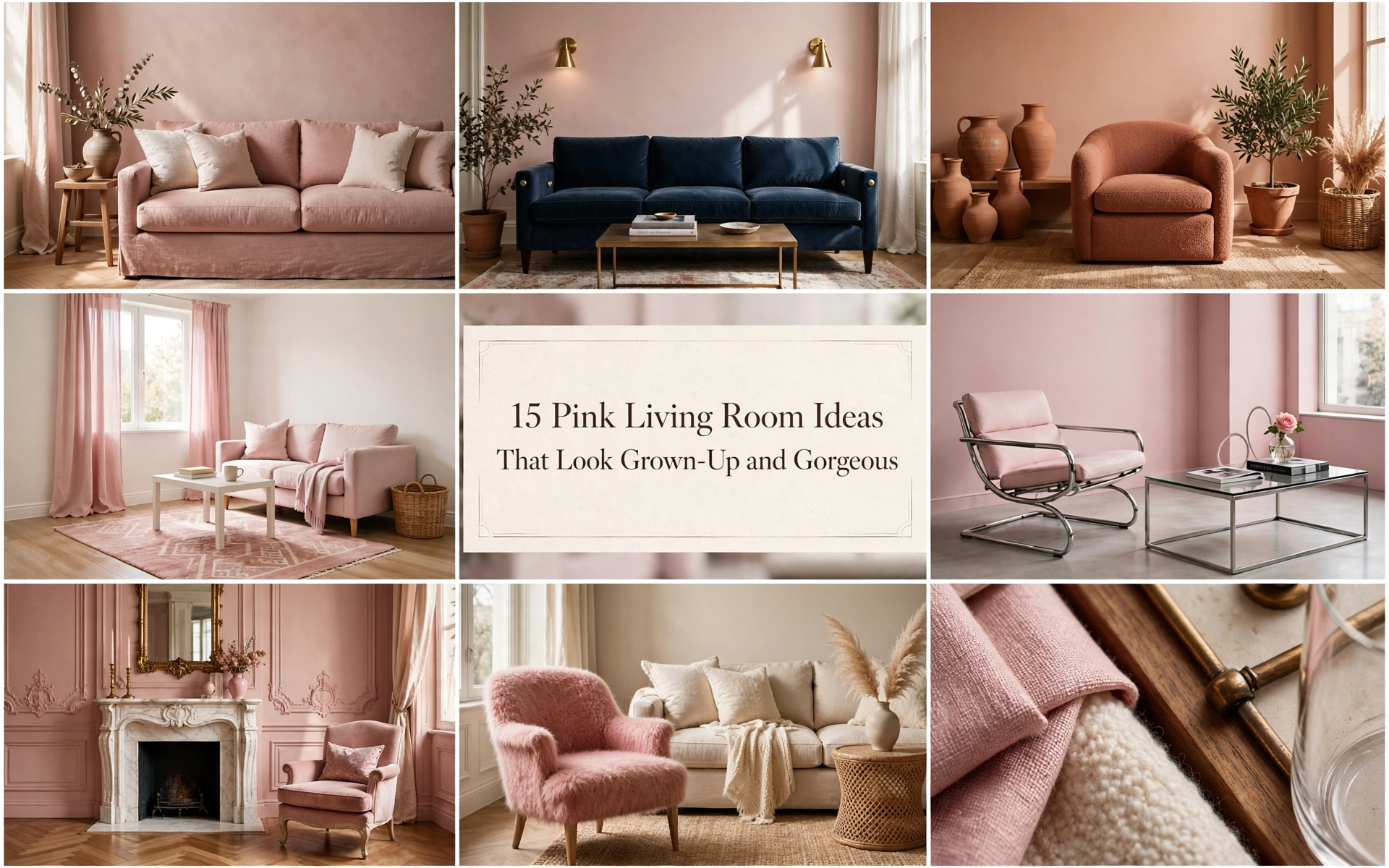
15 Pink Living Room Ideas That Look Grown-Up and Gorgeous
You love pink—but you do not want your living room to look like a candy shop or a teenager’s bedroom. And somehow, every paint chip looks perfect until it covers an entire wall.
The fix isn’t avoiding pink. It’s choosing the right undertone, giving it something grounded to push against, and knowing when to stop. Start with the shade-and-light guide below, then jump to the pink living room ideas that feel most like you.
Choose the Right Pink for Your Light

Pink changes dramatically throughout the day. A barely-there blush can look chalky in cool northern light, while a warm plaster pink may turn peach in a sunny, south-facing room.
- North-facing room: Try warm plaster, salmon-beige, or muted coral. Avoid icy pinks with blue undertones.
- South-facing room: Cooler blush, mauve, and dusty rose can absorb the warm light without becoming saccharine.
- East-facing room: Test the color morning and evening; gentle rose and peach-pink usually remain friendly.
- West-facing room: Choose an earthier, slightly grayed pink so late-afternoon sun does not make it flare orange.
- Low-light room: A deeper clay pink can feel intentional and cocooning. Going paler will not necessarily make the room feel brighter.
Paint two coats on large movable boards and observe them beside the sofa, flooring, and curtains for at least 48 hours. The existing materials—not the white paint card—determine how the pink reads.
Designer Tip: If the room contains warm oak, cream, or tan, begin with a warm pink. If it contains blue-gray stone, chrome, or crisp white, test a cooler blush or mauve.
Common Mistake: Choosing a pink from a phone screen. Screen brightness hides undertones, and inspiration photos are heavily influenced by daylight and editing.
Budget Hack: Buy sample pots before buying decor. A small test costs less than changing cushions, rugs, and art to rescue the wrong wall color.
Luxury Upgrade: Ask for a hand-painted sample in the exact finish you plan to use. Limewash, matte emulsion, and gloss can make the same color look completely different.
Use the 60–30–10 Rule

For an easy, balanced room, use roughly 60% dominant color, 30% secondary color, and 10% accent. Pink can occupy any one of those roles—but it should not automatically fill all three.
For example: warm white walls at 60%, a dusty pink sofa and curtains at 30%, then olive and dark bronze at 10%. Or reverse it: pink walls, oatmeal upholstery, and small oxblood accents.
The rule is a starting point, not a measuring exercise. Its real purpose is to create hierarchy, so the eye knows what matters.
Designer Tip: Repeat your accent color three times at different heights: perhaps in a rug, a lamp, and artwork. That makes contrast feel deliberate.
Common Mistake: Buying every pink item in the same shade. A room needs tonal shifts and neutral pauses to feel collected.
Budget Hack: Photograph the room in black and white. If everything blends into one gray value, add something notably darker or lighter.
Luxury Upgrade: Repeat pink through different materials—wool, lacquer, stone, and velvet—rather than identical color-matched accessories.
15 Pink Living Room Ideas
1. Treat Plaster Pink as a Neutral

Muted plaster pink has beige and clay underneath, so it warms a room without demanding constant attention. It suits relaxed modern, Mediterranean, and quietly traditional homes—and it is especially useful when plain beige feels too safe.
Recreate it with matte plaster-pink walls, an oatmeal sofa, mid-tone wood, and one dark anchor such as a bronze floor lamp. Keep patterns restrained and let linen, wool, and aged timber provide depth.
- Common Mistake: Pairing it with brilliant white, which can make the pink look dirtier by comparison.
- Budget Hack: Paint only the walls and restyle what you own in cream, wood, and black.
- Luxury Upgrade: Use mineral paint or limewash for subtle tonal movement.
2. Ground Blush With Chocolate Brown

Chocolate brown gives pale pink weight and makes it feel current, warm, and grown-up. This pairing is ideal for rooms with wood floors, vintage furniture, or a household that wants pink without an overtly feminine mood.
Choose blush for the broad surface and brown for substantial pieces: a walnut cabinet, leather chair, dark wood table, or cocoa rug. Add cream to prevent the palette from becoming heavy.
- Designer Tip: Repeat brown in at least two materials, such as timber and leather.
- Budget Hack: Add dark-stained frames and cocoa cushions to a blush room.
- Luxury Upgrade: Introduce a sculptural walnut cabinet or mohair lounge chair.
3. Pair Dusty Rose With Olive Green

Green naturally counterbalances pink, and muted versions of both colors feel botanical rather than high-contrast. This look suits cozy traditional rooms, bohemian spaces, and homes with plenty of plants.
Use dusty rose on the walls or sofa, then add olive in one confident block—a chair, curtains, or a large rug. Natural cane and warm wood bridge the two.
- Common Mistake: Scattering many tiny green accessories; choose one or two substantial green moments.
- Budget Hack: Bring in olive cushion covers and a tall plant in an aged pot.
- Luxury Upgrade: Add custom olive linen drapery or a moss-green mohair chair.
Image prompt: Ultra realistic editorial interior photography of a dusty rose living room with olive green linen curtains, moss velvet armchair, warm oak furniture, large sculptural houseplant and antique brass lamp, natural sunlight, soft realistic shadows, correct exposure, sharp focus on complementary muted colors, clean uncluttered composition, high resolution, true-to-life color grading, authentic textures, magazine/Architectural Digest quality — NOT AI-looking.
4. Make a Pink Sofa the Only Pink Moment

A pink sofa is powerful precisely because it does not need backup dancers. Against warm white, stone, or pale gray walls, it becomes art you can sit on. This is best for renters or color-lovers who are not ready to paint.
Choose a simple silhouette in dusty rose, raspberry, or muted coral. Ground it with a neutral rug and coffee table, then pull just a trace of the sofa color into one artwork.
- Designer Tip: Order the largest fabric swatch available and view it horizontally; upholstery catches light differently from walls.
- Budget Hack: Use a fitted cover on an existing sofa or start with one pink armchair.
- Luxury Upgrade: Commission a curved sofa in performance velvet or textured wool.
5. Color-Drench a Small Room

Painting the walls, trim, and ceiling in one pink removes visual stop-start lines and can make a compact room feel more enveloping. It works beautifully in a snug, den, or low-light living room where mood matters more than apparent size.
Choose a grayed rose or earthy mauve, then vary the sheen: matte walls, eggshell trim, flat ceiling. Keep upholstery a shade lighter or darker so furniture does not disappear.
- Common Mistake: Using the same sheen everywhere, which flattens the architecture.
- Budget Hack: Drench just a reading nook or alcove.
- Luxury Upgrade: Lacquer built-ins in the wall color for a jewel-box effect.
6. Add a Graphic Black Edge

Black gives pink crisp boundaries, pulling it toward modern, editorial, or Art Deco territory. It is perfect for anyone worried that blush will feel too sweet.
Start with pale pink walls and use black in thin, deliberate lines: window frames, picture frames, lamp stems, and one coffee table. Keep large upholstery light so the contrast does not become harsh.
- Designer Tip: Use soft black or charcoal instead of pitch black in low-light rooms.
- Budget Hack: Swap frames, lampshades, and cabinet handles.
- Luxury Upgrade: Add steel-framed glass doors or a honed black stone table.
7. Layer a Tonal Pink Palette

Monochrome succeeds when the shades and textures vary. Blush, dusty rose, raspberry, and oxblood can create depth without introducing a competing color story. This is for confident color-lovers and maximalists who still want cohesion.
Begin with the quietest pink on the largest surface, then deepen as objects get smaller. Mix matte paint, linen, velvet, glass, and wool; add a small amount of warm white or dark wood as visual breathing room.
- Common Mistake: Matching every textile exactly.
- Budget Hack: Dye or replace cushion covers in three pink values.
- Luxury Upgrade: Add a hand-knotted rug that graduates from blush to wine.
8. Mix Pink With Navy or Teal

Deep blue cools and steadies pink while preserving richness. Navy creates tailored elegance; teal feels more playful and jewel-like. Both work well in period rooms, eclectic apartments, and spaces used mainly at night.
Use one color as the background and the other as the focal piece. A navy room with a rose sofa feels dramatic; blush walls with a navy sofa feel brighter and more versatile.
- Designer Tip: Add warm brass or walnut to connect the warm and cool halves.
- Budget Hack: Use navy curtains and one pink throw against neutral walls.
- Luxury Upgrade: Add teal lacquered joinery or a navy mohair sofa.
9. Warm Pink With Terracotta and Rust

Pink, terracotta, and rust share a warm red base, producing an earthy sunset palette rather than a pastel scheme. It works especially well with Mediterranean, bohemian, desert-modern, and mid-century interiors.
Choose a peachy plaster pink, then add rust through cushions or a chair and terracotta through pottery. Cream and pale oak prevent the warmth from becoming muddy.
- Common Mistake: Mixing too many orange-leaning shades without a pale neutral pause.
- Budget Hack: Group thrifted terracotta vessels on a shelf.
- Luxury Upgrade: Add a rust-colored wool rug and handmade clay lighting.
10. Use Pink in a Neutral Rental

When paint is forbidden, build a removable pink layer through a rug, curtains, art, cushions, and one lamp. This is for renters and commitment-shy decorators who want impact without losing a deposit.
Pick one hero textile—usually the rug or curtains—and repeat one of its pinks twice. Keep the remaining pieces neutral so the additions read as a palette, not clutter.
- Designer Tip: Hang curtains high and wide to make the color feel architectural.
- Budget Hack: Frame pink-toned fabric remnants as art.
- Luxury Upgrade: Invest in a large rug and full-length lined curtains that can move with you.
11. Modernize Pink With Chrome

Chrome cuts through pink’s softness with a cool, reflective finish. Paired with clean shapes, it creates a contemporary or 1970s-revival room without relying on predictable rose gold.
Use cooler mauve or powder pink with a tubular chrome chair, polished lamp, or glass-and-chrome table. Balance the shine with a thick wool rug and matte upholstery.
- Common Mistake: Making every hard finish metallic; one or two chrome pieces are enough.
- Budget Hack: Add a vintage chrome floor lamp.
- Luxury Upgrade: Source an iconic chrome lounge chair or sculptural lighting.
12. Soften Traditional Architecture

Pink can make ornate molding, a fireplace, or built-ins feel less formal without erasing their character. Dusty blush works particularly well in Victorian, Georgian, and cottage rooms.
Paint the walls and trim in related pinks, retain aged wood, and mix tailored upholstery with one gently patterned textile. Antique brass feels more natural here than highly polished gold.
- Designer Tip: Let the architecture lead; use pink to reveal detail, not compete with it.
- Budget Hack: Paint the fireplace surround or built-ins only.
- Luxury Upgrade: Add custom Roman blinds and antique seating reupholstered in rose linen.
13. Go Bold With Raspberry Accents

Raspberry is energetic, so a little carries across the room. It is ideal for neutral spaces that feel finished but forgettable and for people who like color in fashion more than on walls.
Add one raspberry chair or ottoman, then echo it in a tiny artwork or book spine. Surround it with camel, cream, warm gray, or olive to keep the effect sophisticated.
- Common Mistake: Repeating bright pink in every corner until it loses impact.
- Budget Hack: Re-cover a small stool or add a single vivid lampshade.
- Luxury Upgrade: Commission a raspberry mohair accent chair.
14. Create a Soft Scandinavian Pink Room

Pale pink warms Scandinavian simplicity without disturbing its calm. This is a natural fit for small living rooms, light-wood furniture, and anyone who values visual quiet.
Keep walls warm white and use pink in one flat-woven rug, cushions, or a compact sofa. Add birch, ash, paper lighting, and off-white wool; avoid glittery finishes and overly fluffy accessories.
- Designer Tip: Favor dusty, chalky pink over baby pink.
- Budget Hack: Add a washable flat-weave rug and one throw.
- Luxury Upgrade: Choose handcrafted pale-oak furniture and a wool bouclé sofa.
15. Transform a Beige Room Without Replacing Everything

Beige is not a bad starting point; it is the supporting cast pink needs. Add one medium-scale pink element, one pattern that combines pink and beige, and a dark outline. This is for anyone staring at a safe room and wondering why it has no pulse.
Keep the sofa and major case goods. Add dusty-rose curtains or a rug, switch two cushions, introduce art, and paint a small cabinet or alcove. The room gains personality without a landfill-bound makeover.
- Common Mistake: Buying many small accessories instead of one high-impact textile.
- Budget Hack: Start with curtains, cushion covers, and a thrifted frame painted dark brown.
- Luxury Upgrade: Add a custom rug that connects the existing beige upholstery to the new pink.
How to Make Pink Look Expensive

Expensive-looking rooms are rarely about filling them with expensive things. They are about scale, restraint, and materials that become more beautiful up close.
- Choose a muddied pink. A little brown, gray, or clay in the undertone makes pink easier to live with.
- Add something dark. Walnut, charcoal, oxblood, or bronze gives the palette definition.
- Size the rug correctly. At minimum, the front legs of the seating should sit on it.
- Vary texture, not just color. Linen beside lacquer, wool beside glass, velvet beside aged wood.
- Use fewer, larger objects. One substantial lamp or artwork looks calmer than a dozen pink trinkets.
- Control the light. Warm lamps at multiple heights flatter pink after sunset; a single cool ceiling light does not.
- Leave negative space. Pink becomes more powerful when the eye gets neutral places to rest.
Designer Tip: Before shopping, write a one-line palette: “plaster pink + oatmeal + walnut + olive.” If an item does not belong to that sentence, leave it behind.
Conclusion
Picture the room at dusk: the pink has deepened, the wood looks richer, the lamps are glowing, and the sofa is the place everyone drifts toward. It feels warm, confident, and unmistakably yours—not themed, not timid, and certainly not sugary.
Choose the version that made you pause, bring home two paint samples or one fabric swatch, and make your first move this weekend. Your living room is closer than you think.
Frequently Asked Questions
Is pink a good color for a living room?
Yes. Muted pinks bring warmth like beige but feel more personal, while stronger pinks create energy and focus. The key is balancing pink with natural materials, a neutral, and at least one grounding dark tone.
What color goes best with pink in a living room?
Olive green is a reliable complementary pairing, while chocolate brown makes pink feel especially sophisticated. Navy, warm white, terracotta, burgundy, and charcoal also work; the best choice depends on the pink’s undertone.
How do I make a pink living room look grown-up?
Choose a dusty, plaster, clay, or mauve-based pink instead of a very bright candy shade. Add tailored furniture, substantial wood or stone, restrained patterns, and black, brown, or bronze accents.
What shade of pink makes a living room look bigger?
A pale pink with the right undertone can visually soften boundaries, especially when walls and trim share the color. Match it to the room’s natural light and keep bulky furniture close in value so contrast does not chop up the space.
Can I use pink in a small living room?
Absolutely. Try pale pink as a warm neutral, or embrace a deeper rose with color-drenched walls and trim for a cocooning effect. Keep the palette tight and choose a few correctly scaled pieces instead of many small ones.
Does gray go with pink in a living room?
Yes, but undertones matter. Warm gray works with plaster, peach, and dusty pink; blue-gray suits cooler blush and mauve. Add wood or cream so the combination does not feel flat or cold.
How can I add pink without painting?
Use one large textile—curtains, a rug, or a sofa cover—then repeat the pink once or twice in art or cushions. Peel-and-stick wallpaper, lamps, and painted freestanding furniture are also renter-friendly.
What curtains work with pink walls?
Warm white or oatmeal linen keeps the room airy; olive, chocolate, navy, or tonal rose creates more drama. Hang curtains close to the ceiling and extend the rod beyond the window to make them look generous.
Is a pink sofa a timeless choice?
A simple sofa in dusty rose, muted coral, or plaster pink is more enduring than a trend-led shape in neon pink. Select durable fabric, keep the surrounding palette flexible, and test a large swatch in your room first.
How many pink items should be in a living room?
There is no fixed number; think in visual proportion. Let pink be the dominant color, the supporting color, or the accent—not all three at equal strength—and repeat it enough to feel intentional.


