
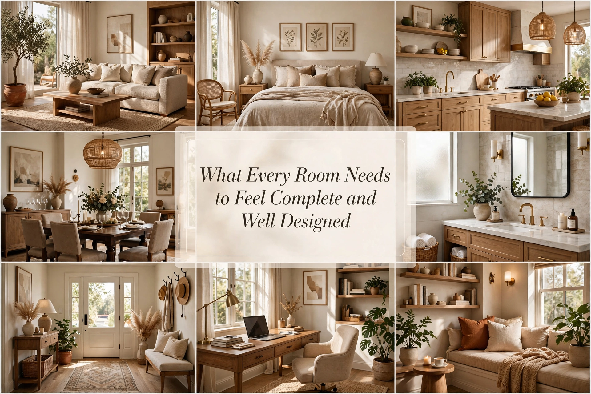
What Every Room Needs to Feel Complete and Well Designed
Have you ever finished furnishing a room, stood in the doorway, and thought, Why does this still not feel right?
The sofa may be comfortable. The walls may be freshly painted. You may even have attractive cushions, artwork, and accessories. Yet the room feels more like a collection of purchases than a place with a clear identity.
That uncomfortable feeling is rarely solved by buying one more decorative object. A room usually feels incomplete because one of its essential design layers is missing: function, scale, visual hierarchy, atmosphere, personality, or balance.
A well-designed room does not need to be expensive, large, or perfectly coordinated. It needs to make visual and emotional sense. Your eye should know where to rest, your body should know how to move through it, and your personality should be visible without the room becoming crowded.
The following principles work in living rooms, bedrooms, dining rooms, home offices, and even small rentals. Use them as a diagnostic system—not a compulsory shopping list.
1. Begin with a Clear Purpose
Every complete room needs a reason for existing beyond “this is where the furniture fits.”
A living room designed for family movie nights requires different seating, lighting, and surfaces from one used mainly for entertaining. A bedroom meant to encourage sleep should not be organized around a bright television or cluttered work desk. Good design begins when the room supports the life taking place inside it.
Before changing anything, write down the room’s three most important activities. For example:
- Relaxing
- Reading
- Talking with guests
Now assess whether the layout, lighting, and furniture support those activities. If reading matters but there is no lamp beside your favorite chair, the room is not functionally complete—regardless of how attractive it looks.
Designer Tip: Design around repeated behavior, not an imaginary special occasion. The way you live on an ordinary Tuesday matters more than how the room might be used twice a year.
Common Mistake: Giving every possible activity equal priority. Too many functions create competing furniture zones and make the room feel restless.
Budget Hack: Rearrange what you already own before shopping. A chair moved beside a window and paired with a borrowed lamp can create a useful reading area for free.
Luxury Upgrade: Commission a built-in solution, such as a window seat, library wall, banquette, or concealed media cabinet, that supports the room’s main function while adding architectural character.
2. Create a Layout That Supports Real Life

Furniture placement determines whether a room feels composed or accidental.
A finished layout has clear pathways, comfortable conversation distances, accessible tables, and breathing room around important pieces. Furniture should relate to other furniture—not cling nervously to the walls.
In a living room, pull at least some seating inward when space allows. Chairs should face the sofa closely enough for conversation, and every main seat should have access to a table or surface. In a bedroom, the bed should command the room without obstructing doors or storage. In a dining room, leave approximately 36 inches behind chairs where possible so people can move comfortably.
The goal is not perfect symmetry. It is a sense that every piece has been placed deliberately.
Styling Secret: Photograph the room from the doorway. A photograph flattens the scene and makes awkward gaps, weak focal points, and lopsided furniture arrangements much easier to notice.
Common Mistake: Pushing everything against the perimeter. This often creates a dead zone in the center and weakens conversation.
Budget Hack: Use painter’s tape to mark potential furniture positions before lifting or buying anything.
Luxury Upgrade: Replace several undersized pieces with one correctly scaled statement piece. Fewer substantial items generally look more sophisticated than many small ones.
3. Give the Room a Strong Focal Point
A focal point tells the eye where to land first. Without one, every object competes for attention and the room feels visually uncertain.
A fireplace, large artwork, upholstered headboard, sculptural pendant, beautiful view, or distinctive cabinet can become the visual anchor. The surrounding pieces should support it rather than challenge it.
If the room already has a natural focal point, emphasize it. Position seating toward the fireplace, frame a view with curtains, or choose artwork that relates to the room’s primary wall. If there is no architectural feature, create one using paint, art, lighting, or furniture.
This is especially useful in box-shaped rooms, new-build homes, and rentals with limited character.
Designer Tip: Stand at the main entrance and notice where your eye travels. If it bounces between several equally bold features, reduce one or two of them.
Common Mistake: Creating competing focal points—a dramatic television wall, bright gallery wall, bold rug, and oversized chandelier all demanding attention simultaneously.
Budget Hack: Paint one wall, frame a meaningful textile, or group inexpensive prints into a single large composition.
Luxury Upgrade: Add millwork, a stone fireplace surround, integrated shelving, or a large commissioned artwork.
4. Anchor the Furniture with the Correct Rug

A rug is not simply a decorative patch beneath a coffee table. It visually connects furniture and establishes the boundaries of a room or activity zone.
In a living room, the rug should usually be large enough for at least the front legs of the sofa and chairs to rest on it. In a bedroom, it should extend beyond the sides of the bed where your feet land. In a dining room, it must remain beneath the chairs when they are pulled out.
An undersized rug creates the impression that the furniture is drifting apart. A generously scaled rug makes the same pieces feel related and intentional.
Common Mistake: Choosing rug size according to price rather than furniture arrangement.
Budget Hack: Place a smaller patterned rug over a large, affordable jute or sisal-style base.
Styling Secret: If you are unsure about size, mark the rug’s dimensions with painter’s tape. Live with the outline for a day before ordering.
Luxury Upgrade: Choose a hand-knotted wool rug with subtle color variation, or commission a rug sized precisely for the room.
5. Build a Cohesive Color Story
A designed room does not require every object to match. It needs colors that communicate with one another.
Begin with a dominant neutral or foundational color, add one supporting shade, and introduce one or two accents. Repeat the accents in different parts of the room so your eye moves naturally through the space.
For example, the muted green in an artwork might reappear in a cushion, plant, and ceramic bowl. The repetition should be subtle enough to feel discovered rather than manufactured.
A useful starting framework is:
- Approximately 60% dominant color
- 30% supporting color
- 10% accent color
Treat this as a visual guide, not a mathematical law. Rooms with layered neutrals may rely more on tonal variation and texture than obvious accent colors.
Common Mistake: Buying a matching furniture and accessory set. Excessive coordination removes the tension and variation that give rooms personality.
Budget Hack: Gather accessories from other rooms according to color. Repeating objects you already own can establish cohesion without spending anything.
Luxury Upgrade: Develop a tonal palette through plaster, natural stone, custom upholstery, stained wood, and hand-finished textiles rather than relying solely on paint.
6. Layer Lighting at Different Heights

One ceiling light can illuminate a room, but it rarely completes it.
Well-designed rooms combine three lighting layers:
- Ambient lighting for general visibility
- Task lighting for reading, working, cooking, or grooming
- Accent lighting for artwork, shelves, architectural features, and atmosphere
The most inviting rooms distribute light at different heights. A pendant draws attention upward, table lamps create intimate pools of light, and a floor lamp brightens a neglected corner.
Use warm bulbs—generally around 2700K in living rooms and bedrooms—for a soft evening atmosphere. Keep bulb temperatures consistent within the same visual zone so the room does not appear patchy.
This principle matters most in rooms that feel pleasant during daylight but stark after sunset.
Designer Tip: Turn off the overhead fixture and evaluate the room using lamps alone. Dark holes will reveal where another light source is needed.
Common Mistake: Choosing fixtures only for their appearance and ignoring the quality, direction, and temperature of the light.
Budget Hack: Add plug-in sconces, thrifted lamp bases, or rechargeable picture lights. A new shade can make an inexpensive lamp look custom.
Luxury Upgrade: Install dimmers, concealed LED lighting, art lights, and separate circuits that allow different moods to be created.
7. Introduce Textural Contrast
Color attracts attention, but texture makes a room feel physically inviting.
A flat room often contains too many surfaces with similar visual qualities: smooth painted walls, smooth laminate furniture, plain upholstery, and glossy screens. Introduce contrast through soft, rough, woven, reflective, matte, and organic materials.
A simple texture formula is:
- One soft material: wool, velvet, bouclé, or linen
- One natural or irregular material: wood, rattan, stone, or clay
- One smooth or reflective material: glass, polished metal, or glazed ceramic
The contrast allows even a quiet neutral room to feel rich. This is ideal for minimalist interiors, where color is restrained but depth is still essential.
Styling Secret: Contrast neighboring surfaces. A rough ceramic lamp is more noticeable on a polished table; a soft throw becomes more inviting against a structured leather chair.
Common Mistake: Interpreting texture as “add more cushions.” Texture should appear throughout the room, including walls, windows, floors, lighting, and furniture.
Budget Hack: Add a woven basket, linen lampshade, secondhand wooden stool, or nubby throw.
Luxury Upgrade: Use full-length linen drapery, limewash, grasscloth, natural stone, solid timber, and bespoke upholstery.
8. Finish the Windows

Unfinished windows can make an otherwise beautiful room feel temporary.
Curtains soften hard architectural edges, improve acoustics, control light, and visually increase height. Mount the rod close to the ceiling and extend it beyond the window frame where practical. This allows the fabric to frame rather than cover the glass.
Choose enough fabric to create relaxed fullness when the curtains are closed. Panels that barely meet in the middle tend to look thin.
Roman shades, woven blinds, café curtains, shutters, and simple linen panels can all work. The correct choice depends on privacy, light, architecture, and the room’s formality.
Common Mistake: Hanging a curtain rod directly above the window frame with short panels ending above the floor. This visually compresses the wall.
Budget Hack: Join ready-made panels for greater fullness or use simple cotton curtains with a more substantial heading.
Luxury Upgrade: Install ceiling-mounted, lined, pinch-pleat curtains with tailored returns and concealed tracks.
9. Add Artwork at the Correct Scale
Artwork supplies emotion, personality, color, and a point of view. It is often the layer that turns a tasteful room into your room.
Scale matters more than price. A tiny frame floating above a large sofa makes the wall and furniture feel disconnected. As a general starting point, art above a sofa, bed, or console can occupy roughly two-thirds of the furniture’s width.
You can achieve this with one large work, a diptych, or a tightly organized gallery. Hang art in relationship to furniture rather than automatically centering it on the wall.
Choose work that creates a genuine response—curiosity, calm, humor, nostalgia, or energy. It does not need to match every cushion.
Designer Tip: Cut paper to the artwork’s dimensions and tape it to the wall before hanging.
Common Mistake: Placing art too high. The composition should connect visually with the furniture beneath it.
Budget Hack: Frame children’s drawings, vintage book plates, fabric remnants, personal photographs, maps, or downloadable public-domain art.
Luxury Upgrade: Commission an original piece using colors and proportions developed specifically for the room.
10. Balance Visual Weight
Visual weight describes how heavy or attention-grabbing an object appears. Dark colors, solid forms, large patterns, and substantial furniture carry more weight than transparent, pale, or delicate pieces.
A room can feel incomplete because all its visual weight sits on one side. A large dark sofa may require a tall lamp, artwork, substantial curtains, or a cabinet elsewhere to restore balance.
Balance does not require identical objects. A tall plant and floor lamp can visually counter a bookcase. Two lighter chairs can balance one dark sofa.
This principle is particularly helpful in asymmetrical rooms and open-plan spaces.
Styling Secret: Squint while looking at the room. Details disappear, leaving the strongest blocks of light and dark. Imbalance becomes easier to spot.
Common Mistake: Correcting imbalance by adding several small accessories. Small objects rarely counteract one large, visually heavy piece.
Budget Hack: Use height, contrast, and grouped objects rather than buying another large item.
Luxury Upgrade: Introduce a custom cabinet, monumental artwork, sculptural light, or stone table with the precise mass the composition needs.
11. Bring in an Organic Element

Rooms built entirely from straight lines and manufactured surfaces can feel rigid. Organic elements add irregularity, movement, and life.
A potted tree, leafy plant, branch arrangement, bowl of fruit, fresh flowers, driftwood, stone, or handmade ceramic can soften a polished scheme. Greenery is valuable, but it is not the only option—especially in rooms with poor natural light.
Choose an organic element with enough scale to register. One substantial olive tree often has more impact than six tiny pots scattered around the room.
Common Mistake: Placing small artificial plants on every available surface. Repetition can look like filler rather than nature.
Budget Hack: Arrange a branch from the garden in a tall secondhand vase.
Luxury Upgrade: Invest in a mature indoor tree, sculptural stone vessel, or professionally composed seasonal arrangement.
12. Include Something Personal
A complete room should reveal who lives there.
Personalization does not mean covering every surface with memorabilia. It means choosing a few objects that could not have been selected for just anyone: an inherited chair, travel photograph, handmade bowl, family book collection, musical instrument, or artwork created by a friend.
These objects prevent the room from feeling copied from a catalog. They also create emotional permanence; trends may change, but meaningful pieces continue to belong.
Display personal objects with the same care you would give expensive décor. Frame the textile. Light the painting. Place the inherited vase where it can breathe.
Designer Tip: Ask, “What in this room tells my story?” If the answer is nothing, the room may look attractive without feeling emotionally complete.
Common Mistake: Displaying everything sentimental at once. Editing gives meaningful objects greater presence.
Budget Hack: Print one personal photograph in a generous size and place it in a thrifted frame.
Luxury Upgrade: Restore, reupholster, or professionally frame an heirloom so it becomes a central part of the design.
13. Create One Intentionally Styled Moment
A styled moment, or vignette, is a small composition that rewards closer attention. It might appear on a console, coffee table, mantel, dresser, or shelf.
Use variation in height, shape, and material:
- Something vertical
- Something horizontal
- Something sculptural
- Something natural or personal
For example, combine a lamp, two stacked books, a shallow bowl, and a small branch. The objects should overlap slightly in the viewer’s line of sight so they feel connected.
A tray can organize practical items, but not every vignette needs one. The goal is to create a meaningful visual pause, not to fill the surface.
Common Mistake: Distributing small objects evenly across every surface. This creates visual static.
Budget Hack: Shop your bookshelves, kitchen cabinets, and storage before buying dedicated décor.
Luxury Upgrade: Mix antique objects, artisan ceramics, sculptural lighting, and art books with varied patina.
14. Use Negative Space
What you leave empty is as important as what you decorate.
Negative space allows focal points to remain clear, pathways to feel comfortable, and meaningful objects to receive attention. Without it, the eye cannot distinguish what matters.
An empty section of wall beside large artwork may be intentional. A clear portion of a coffee table makes the room usable. An unoccupied corner can provide breathing room if the rest of the composition feels balanced.
This is particularly important in small rooms, where attempts to “finish” every surface can quickly produce clutter.
Designer Tip: Remove approximately 20% of the accessories, then reassess. The room often feels calmer without appearing empty.
Common Mistake: Assuming every blank wall requires art and every corner requires furniture.
Budget Hack: Editing is free. Temporarily box excess accessories and live without them for a week.
Luxury Upgrade: Let beautiful materials, bespoke joinery, and architectural proportions carry the room with fewer decorative objects.
15. Complete the Room with a Sensory Layer
A room can look finished in a photograph and still feel incomplete in person because design is experienced through more than sight.
Consider:
- How the room sounds
- How surfaces feel
- How the air smells
- Whether the temperature is comfortable
- How the lighting changes during the evening
Curtains, rugs, books, and upholstered furniture reduce harsh echoes. Natural fabrics create tactile warmth. A subtle signature scent can help a room feel cared for, but it should never overpower the space.
Comfort is the final test. A chair that photographs beautifully but is painful to sit in weakens the entire design.
Styling Secret: Enter the room without looking for flaws. Notice what your body experiences first: glare, echo, coldness, obstruction, or comfort.
Common Mistake: Using many competing scented products or choosing fragrance to disguise ventilation and cleanliness problems.
Budget Hack: Open the windows, wash textiles, add a soft throw, and use one candle or vase of fragrant foliage.
Luxury Upgrade: Incorporate acoustic treatments, radiant heat, automated shades, dimmable lighting scenes, and a restrained home fragrance.
The Five-Minute Room-Completion Audit
Stand in the doorway and assess the room in this order.
1. Function
- Can people perform the room’s main activities comfortably?
- Does every important seat have light and a nearby surface?
- Are walking routes unobstructed?
2. Foundation
- Is the furniture properly scaled?
- Does the rug connect the main pieces?
- Is there a clear focal point?
3. Atmosphere
- Are there at least two or three sources of light?
- Does the room contain soft, natural, and smooth textures?
- Are the windows visually finished?
4. Identity
- Is there meaningful artwork?
- Does the room contain something personal?
- Is there an object with age, irregularity, or craftsmanship?
5. Editing
- Is the visual weight balanced?
- Are accessories grouped rather than scattered?
- Is there enough empty space for the room to breathe?
Do not purchase anything until you identify the weakest category. If the layout is wrong, another cushion will not help. If the lighting is flat, more wall art will not create evening warmth. Solve the structural issue before adding decoration.
Conclusion
Imagine entering your room tonight and feeling your shoulders relax.
The lighting is warm instead of harsh. The rug quietly connects the furniture. The curtains soften the windows, the artwork finally feels proportional, and the objects around you have stories rather than simply filling space. Nothing shouts for attention, yet the room no longer feels empty.
That transformation does not begin at a checkout page. It begins by standing in the doorway and seeing the room honestly.
Choose the weakest layer—perhaps the layout, lighting, scale, texture, or personality—and improve only that first. Then live with the change long enough to notice what the room asks for next.
Frequently Asked Questions
1. What does every room need to feel complete?
Every room needs a clear purpose, functional layout, appropriate furniture scale, focal point, layered lighting, textural variety, a cohesive color story, finished windows, correctly scaled art, an organic element, something personal, and sufficient negative space. Not every category requires a new purchase; many can be achieved by rearranging and editing existing belongings.
2. Why does my room feel unfinished even though it has furniture?
Furniture provides function, but it does not automatically create atmosphere or identity. The room may lack an anchor, such as a large rug; vertical interest, such as curtains or artwork; warm evening lighting; textural contrast; or personal objects. Diagnose the missing layer before buying more décor.
3. How do I make a room look professionally designed?
Establish one focal point, use furniture of appropriate scale, repeat colors and materials, layer lighting at different heights, hang art in relationship to furniture, and mix rather than match every piece. Professional rooms also contain carefully planned negative space.
4. What is the most important finishing touch in a room?
There is no universal final object. The most important finishing touch is the one that corrects the room’s greatest weakness. It might be a large rug in a disconnected seating area, curtains in a stark bedroom, lamps in a cold living room, or personal art in a generic scheme.
5. How can I make a room feel complete on a small budget?
Start by rearranging furniture, removing excess accessories, and moving lamps, art, cushions, and decorative objects between rooms. Add inexpensive changes only after diagnosing the problem. Larger-impact affordable improvements include full-length curtains, warm bulbs, secondhand lamps, oversized thrifted art, and a natural branch arrangement.
6. How many colors should a well-designed room have?
Most rooms benefit from one dominant color, one supporting color, and one or two accents. However, the exact number matters less than intentional repetition. Repeating an accent in three areas can create cohesion without making the room appear overly matched.
7. How many light sources should a room have?
A typical living room or bedroom benefits from at least three light sources, ideally positioned at different heights. Combine ambient, task, and accent light. Small rooms may need fewer fixtures, while large or open-plan spaces require multiple lighting zones.
8. Does every room need an area rug?
No. Rooms with beautiful floors, kitchens, and certain dining spaces may work without one. However, rugs are extremely useful for defining zones, connecting furniture, reducing echo, and adding softness. If you use a rug, scale it to the furniture grouping rather than the empty floor.
9. Does every room need curtains?
Not necessarily. Beautiful architectural windows, privacy glass, shutters, or minimalist shades may be sufficient. Curtains are valuable when the room needs softness, height, light control, acoustic comfort, or a more finished appearance.
10. How do I know whether my artwork is too small?
Artwork is probably too small if it appears to float independently above the furniture. As a starting guideline, art or an art grouping above a sofa, bed, or console can occupy approximately two-thirds of that furniture’s width.
11. How do I make a neutral room feel less boring?
Use variation in texture, tone, shape, and age. Combine smooth plaster, woven linen, warm wood, aged metal, wool, glass, and handmade ceramics. Add one dark grounding element and an organic form to prevent the palette from appearing washed out.
12. How do I decorate without making the room cluttered?
Group small accessories into intentional compositions instead of distributing them evenly. Vary height and material, leave part of every surface clear, and remove objects that do not contribute function, meaning, texture, or visual balance.
13. What makes a room feel luxurious?
Luxury is communicated through scale, proportion, material quality, lighting, and restraint. Full curtains, substantial rugs, consistent hardware, warm dimmable lighting, natural materials, and a few large objects usually look more elevated than numerous small decorative purchases.
14. How do renters make a room feel finished?
Renters can use large rugs, full-height removable curtains, plug-in sconces, rechargeable picture lights, oversized leaning art, removable wallpaper, freestanding shelves, plants, and furniture layouts that create architectural zones without permanent alterations.
15. How do I know when to stop decorating?
Stop when the room functions comfortably, has a clear focal point, feels visually balanced, reflects your personality, and contains enough open space for important pieces to register. If a new object does not improve function, balance, meaning, texture, or atmosphere, the room may not need it.


