
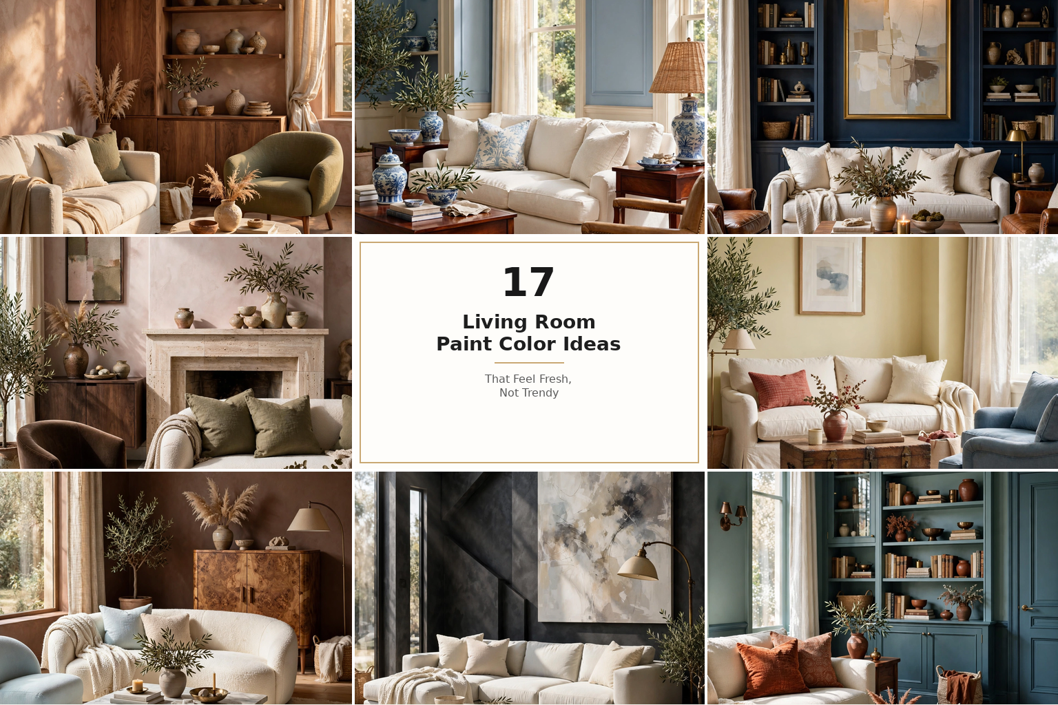
17 Living Room Paint Color Ideas That Feel Fresh, Not Trendy
A living room paint color rarely fails because the shade itself is unattractive. It fails because it was chosen for someone else’s room.
The creamy white that glows in a south-facing photograph may appear gray in a darker, north-facing home. A dramatic navy that feels intimate in a library-like room can become heavy when paired with a charcoal sofa and limited lighting. Even beige can turn pink, yellow, or green when placed beside the wrong flooring.
The best living room paint color ideas begin with the room you already have: its sunlight, flooring, fireplace, upholstery and everyday purpose. Once those elements are considered, color stops being a gamble and becomes a practical design tool.
How to Choose a Living Room Paint Color You Will Still Love
Begin With the Things You Are Not Replacing
A wall color is easier and cheaper to change than a sofa, rug, stone fireplace, or hardwood floor. For that reason, choose paint after identifying the undertones in the room’s fixed elements.
An orange-toned oak floor usually welcomes warm white, olive, oatmeal, terracotta, or warm blue. Blue-gray flooring may work better with muted blue, soft charcoal, cool greige, or a carefully selected white.
Place fabric samples, rug fibers, and paint swatches together. If one suddenly appears dirty, excessively yellow, pink, or green, the undertones are competing.
Designer Tip: If the room contains several undertones, choose a muted wall color rather than a pure one. Complex, slightly grayed colors bridge different materials more gracefully.
Read the Direction of the Light
- North-facing rooms receive cooler, flatter light. Warm whites, beige, putty, ochre, and earthy greens can soften it.
- South-facing rooms receive abundant warm light. They can support cooler blues, greens, grays, and deeper colors.
- East-facing rooms feel brightest in the morning. Test samples during the quieter afternoon, when colors may become cooler.
- West-facing rooms become warmer and more intense late in the day. Avoid undertones that turn excessively orange in sunset light.
Decide How You Want the Room to Feel
Color affects visual atmosphere more reliably than it affects room size. Pale colors usually create a gentle, open transition between surfaces. Dark colors make boundaries less obvious and can create intimacy. Saturated warm colors increase visual energy, while muted greens and blues often feel restorative.
Do not ask only, “Which color is fashionable?” Ask, “How should this room feel at 8 p.m. when we actually use it?”
Understand LRV Without Overcomplicating It
Light Reflectance Value, or LRV, measures how much visible light a color reflects on a scale from 0 to 100. A higher number reflects more light; a lower number absorbs more.
LRV does not tell you whether a color is beautiful, but it helps set expectations:
- 70–90: airy whites and pale colors
- 50–70: versatile light-to-mid tones
- 30–50: grounded mid-tones
- 10–30: deep, dramatic colors
- Below 10: near-black shades
A low-LRV paint can still work in a small room. It simply creates mood instead of pretending the room is flooded with light.
Common Mistake: Choosing the palest possible paint for a dark room. Without enough light, a stark pale color can appear dull and shadowy. A warmer mid-tone may look more intentional.
1. Use Warm White for an Airy Room That Still Feels Inviting

Warm white is the quiet workhorse of living-room design. Unlike brilliant white, it contains a trace of cream, beige, red, or yellow that softens shadows and complements natural materials.
It is especially effective in smaller rooms, open plans, rental homes, and spaces where art, textiles, or furniture should command attention. Pair it with oak, walnut, linen, wool, rattan, aged brass, or warm stone.
Recreate the look by choosing a white that appears only slightly creamy beside a sheet of printer paper. Use the same white on trim in a different sheen for a seamless, contemporary result.
Common Mistake: Combining creamy walls with blue-white trim. The walls may suddenly appear yellow or dingy.
Budget Hack: Keep existing white trim if it coordinates, and repaint only the walls. Test the new white directly beside the trim first.
Luxury Upgrade: Paint walls, trim, and ceiling in related warm whites, then introduce hand-finished plaster, bouclé, veined stone, and unlacquered brass.
2. Choose Soft Ivory When Pure White Feels Too Clinical

Soft ivory sits between white and pale cream. It is more visibly warm than warm white, making it useful in traditional homes, north-facing rooms, and living rooms with brown furniture or honey-colored wood.
Ivory works because it reflects light while taking the harsh edge off pale walls. Add muted blue, faded red, olive, or chocolate accents to prevent it from becoming overly sweet.
Choose an ivory with restrained yellow rather than an obvious buttery cast. In evening light, a strongly yellow cream can look dated.
Styling Secret: Ivory becomes sophisticated when contrasted with one dark note—an ebony frame, black iron lamp, dark wood cabinet, or chocolate velvet chair.
Budget Hack: Use inexpensive ivory paint as the backdrop, then create depth with secondhand wood furniture and washable linen-look curtains.
Luxury Upgrade: Add ivory limewash or a mineral-effect finish to create subtle movement across the walls.
3. Try Mushroom Greige for a Flexible Modern Neutral

Mushroom greige combines beige, gray, and a faint earthy undertone. It has more personality than white but remains quiet enough to support changing furniture and seasonal décor.
It works particularly well with stone fireplaces, off-white sofas, medium wood, black metal, and muted green accessories. It is also useful in open-plan homes because it visually connects kitchens, dining areas, and living spaces.
Look for a greige that relates to the room’s floor. A violet-leaning greige may suit taupe stone, while a green-leaning greige can coordinate with natural oak and botanical colors.
Common Mistake: Assuming every greige is universally neutral. Many shift purple, pink, or green next to fixed materials.
Budget Hack: Use greige throughout the main walls and create variation with affordable cream curtains and textured cushion covers.
Luxury Upgrade: Pair mushroom walls with matching painted joinery, natural travertine, dark walnut, and oversize linen drapery.
4. Bring Back Oatmeal Beige for Relaxed, Sun-Warmed Comfort

Today’s beige is less golden than the builder beige of previous decades. Oatmeal beige has a soft, grain-like warmth that feels organic rather than dated.
It is ideal for homes with brown leather, caramel upholstery, jute rugs, terracotta accessories, and warm timber. Because beige is inherently welcoming, it suits family rooms where comfort matters more than visual formality.
Build a tonal palette by moving from pale cream walls to tan, camel, caramel, and chocolate accents. Add black sparingly to sharpen the composition.
Designer Tip: Beige needs texture. Mix smooth ceramic, nubby wool, woven grass, aged leather, and natural wood so the palette feels layered.
Budget Hack: Update existing beige walls with a large cream rug and one darker brown element before repainting everything.
Luxury Upgrade: Add wall-to-wall linen curtains, custom oak shelving, and honed stone tables in related warm tones.
5. Use Putty Taupe to Make a Living Room Feel Tailored

Putty taupe has enough gray to feel controlled and enough brown to remain comfortable. It is an excellent bridge between traditional architecture and contemporary furniture.
Use it when white feels unfinished but a recognizable color feels too strong. Putty walls pair beautifully with plaster, limestone, dark wood, dusty rose, burgundy, and olive.
For a cohesive result, repeat the wall color in one or two textiles. A taupe stripe, rug border, or ceramic lamp makes the paint feel integrated rather than randomly selected.
Common Mistake: Pairing taupe with too many cool silver-gray furnishings. The room may lose its warmth and appear muddy.
Luxury Upgrade: Paint paneled walls, doors, and skirting in the same putty shade, using a satin finish on woodwork for subtle contrast.
6. Create Calm With Dusty Sage Green

Dusty sage carries the restorative quality of green without dominating a room. Its gray component helps it function almost like a neutral, particularly beside wood, cream, tan, and black.
It is best for relaxed family rooms, cottage interiors, modern organic spaces, and homes with garden views. In a north-facing room, select a sage with enough yellow to stop it from turning icy.
Paint all four walls rather than reducing sage to a predictable accent wall. Keep major furniture neutral and repeat the green in small variations through plants, cushions, or artwork.
Budget Hack: Sage paint can make flat-pack shelving look custom when the unit and wall are painted together.
Styling Secret: Add a small amount of rust, burgundy, or dusty pink. These complementary accents give sage more depth.
Luxury Upgrade: Combine sage walls with reeded oak cabinetry, aged bronze, veined marble, and full-height curtains.
7. Select Earthy Olive for a More Grounded Green Room

Olive feels richer and more historic than sage. Its yellow-brown base connects naturally with leather, timber, aged brass, brick, and traditional patterned rugs.
It is especially effective in rooms used mainly in the evening. Instead of fighting limited light, olive turns it into a cocooning atmosphere.
Use warm lamps at several heights: ceiling fixtures alone can make a deep green room feel flat. Cream lampshades, wall lights, and picture lights reveal the color’s complexity.
Common Mistake: Filling an olive room with too many other murky colors. Add cream or pale stone to provide visual relief.
Budget Hack: Paint the fireplace wall and adjacent alcoves olive, leaving the remaining walls a related warm neutral.
Luxury Upgrade: Color-drench walls, trim, bookcases, and ceiling in graduated olive tones, then add antique artwork and brass picture lights.
8. Use Muted Blue-Green for a Calm but Characterful Backdrop

A muted blue-green changes beautifully throughout the day. It may look fresher in morning light, greener beside warm wood, and deeper under evening lamps.
This shade is useful when one person wants blue and another prefers green. It also pairs well with both cool and warm materials, making it flexible in rooms with mixed finishes.
Choose a grayed version rather than a bright turquoise. Combine it with warm white, camel, walnut, rust, and woven textures.
Designer Tip: Dynamic “chameleon” colors must be tested for a full day. Their ability to shift can be beautiful, but only if you like every version.
Luxury Upgrade: Continue the color across custom cabinetry and doors, then add warm marble and bronze accents.
9. Introduce Powder Blue for a Light, Peaceful Living Room

Powder blue gives a room a gentle wash of color without making it feel visually busy. It suits coastal homes, traditional rooms, small apartments, and spaces with abundant daylight.
The key is avoiding an overly sugary baby blue. Look for a dusty, slightly gray shade and ground it with warm wood, woven fiber, tan leather, or deep blue accents.
A pale blue ceiling above warm-white walls is another subtle approach. It creates an airy impression without committing every wall to color.
Common Mistake: Pairing powder blue only with white. The room can begin to feel themed. Include brown, ochre, or aged metal for maturity.
Budget Hack: Paint above existing wall molding blue and leave the lower section warm white.
Luxury Upgrade: Pair powder-blue walls with tailored pleated curtains, mahogany furniture, and blue-and-white ceramics collected in varied scales.
10. Choose Tailored Navy for a Living Room With Presence

Navy offers drama without the severity of black. It works particularly well in formal living rooms, evening spaces, media rooms, and rooms with strong architectural details.
Deep navy is effective with warm white, walnut, cognac, emerald, ochre, and brass. If the room is small, embrace its intimacy instead of using one isolated navy wall that visually shortens the space.
Use multiple light sources and include pale upholstery or artwork to create contrast. A navy room without sufficient lighting can lose definition after sunset.
Budget Hack: Paint inexpensive bookcases navy to match the wall, producing a convincing built-in effect.
Common Mistake: Using cool, bright-white bulbs. Choose warm light around 2700K–3000K to preserve comfort.
Luxury Upgrade: Color-drench the walls, trim, cabinetry, and ceiling, then introduce polished plaster, velvet, and brass.
11. Try Plaster Pink as a Warm Alternative to Beige

Plaster pink is not a nursery pink. It is a muted mixture of clay, beige, and blush that flatters skin tones and gives a living room warmth without obvious yellow.
It works beautifully with burgundy, olive, chocolate brown, cream, travertine, and dark wood. The shade suits vintage, Mediterranean, contemporary, and softly minimalist interiors.
Select a brown or gray-based pink rather than a cool candy shade. Test it beside upholstery because beige fabric can reveal unexpected peach or violet undertones.
Styling Secret: Treat plaster pink as an earth tone. Pair it with stone, wood, linen, and hand-thrown pottery instead of overly delicate accessories.
Budget Hack: Warm existing furniture with a plaster-pink wall and repeat the tone in one cushion or ceramic vase.
Luxury Upgrade: Use mineral or limewash paint for cloud-like tonal movement.
12. Add Muted Terracotta for Earthy Energy

Muted terracotta brings warmth, sociability, and a sense of handcrafted character. It is particularly effective in living rooms that feel cold, empty, or disconnected from warm wood furniture.
Choose a clay-based shade with brown or pink undertones rather than a bright orange. Balance it with cream, flax, walnut, olive, or dusty blue.
Terracotta is strong enough to define a room but natural enough to age gracefully. It is best for Mediterranean, rustic, eclectic, and modern-organic spaces.
Common Mistake: Repeating terracotta in every accessory. Let the wall be the dominant warm statement and use quieter supporting colors.
Budget Hack: Paint only the fireplace chimney breast and repeat the color in affordable pottery.
Luxury Upgrade: Apply a textured mineral finish and combine it with custom walnut joinery, natural stone, and sculptural lighting.
13. Use Butter Yellow to Brighten a Gloomy Room

Soft butter yellow reflects warmth into a room without the intensity of bright primary yellow. It is useful in north-facing spaces, older homes, and rooms that need optimism.
Choose a creamy, muted yellow that looks almost neutral on the sample card. Pair it with warm white, medium wood, muted red, dusty blue, olive, or chocolate.
Butter yellow works because it mimics the emotional effect of sunlight. In a strongly west-facing room, however, it may become too intense late in the day.
Common Mistake: Selecting yellow from a tiny chip. Yellow expands visually across large surfaces and usually looks stronger on the wall.
Budget Hack: Start with the upper half of a two-tone wall or the inside of built-in shelving.
Luxury Upgrade: Use butter-yellow walls with glossy cream trim, tailored curtains, antique wood, and statement art.
14. Paint the Room Clay Brown for Cocooning Warmth

Brown has returned as an intentional wall color because it provides the depth of charcoal without the same coolness. Clay brown feels grounded, secure, and particularly flattering under warm evening light.
Use it in bright, spacious living rooms or deliberately intimate rooms. Pair it with ivory, pale blue, rose, ochre, olive, brass, and lighter wood to prevent visual heaviness.
A mid-tone brown is easier to live with than near-black espresso. Look for a shade with earthy red or gray undertones rather than a flat chocolate color.
Budget Hack: Use clay brown behind a pale sofa so the furniture gains visual definition.
Luxury Upgrade: Pair brown walls with mohair, burled wood, marble, bronze, and a large pale rug.
15. Select Smoky Charcoal for Modern Architectural Definition

Smoky charcoal gives modern rooms structure. Unlike flat black, it contains blue, green, brown, or violet undertones that allow it to respond to changing light.
It works well behind a fireplace, television, gallery arrangement, or pale sofa. In an open-plan space, charcoal can visually anchor the living zone without a physical divider.
Choose a charcoal related to the room’s existing materials. Brown-charcoal suits warm timber; blue-charcoal complements cool stone and steel.
Common Mistake: Using charcoal with only gray furniture. The result may feel commercial. Add warm wood, cream fabric, leather, or aged brass.
Budget Hack: Use charcoal on one architecturally complete wall—not a randomly selected rectangle.
Luxury Upgrade: Paint walls and cabinetry charcoal, add stone slabs, concealed lighting, and oversized art.
16. Embrace Soft Black for a Small Room With Big Character

Soft black can make a compact living room feel more intentional because dark walls blur corners and reduce visual fragmentation. It does not physically enlarge the room; it creates depth and atmosphere instead.
Select an off-black with brown, charcoal, green, or navy undertones. Use it in rooms with beautiful artwork, warm lighting, pale upholstery, or a compelling view.
Paint all four walls when possible. One black accent wall can look disconnected unless it follows a fireplace, alcove, or other architectural boundary.
Designer Tip: Place mirrors where they reflect lamps, windows, or artwork—not a blank dark wall.
Budget Hack: Dark paint disguises inexpensive shelving and minor surface inconsistencies better than high-contrast white.
Luxury Upgrade: Add satin-finished black trim, velvet upholstery, stone, art lighting, and full-height curtains.
17. Color-Drench the Room for a Cohesive Designer Finish

Color drenching means extending one color—or closely related versions of it—across walls, trim, doors, cabinetry, and sometimes the ceiling.
This technique works because fewer contrast lines interrupt the eye. It can make complicated architecture feel calmer and small rooms feel more unified. Sage, putty, blue-green, olive, burgundy, and navy all respond well to it.
For a manageable version, use eggshell on walls, satin on woodwork, and matte on the ceiling. The finish change creates dimension without adding another color.
Common Mistake: Color-drenching without testing artificial light. A beautiful daytime shade may become heavy or strangely saturated at night.
Budget Hack: Start by painting the walls, trim, and one inexpensive cabinet the same color.
Luxury Upgrade: Add matching custom joinery, concealed doors, fabric in tonal shades, and architectural lighting.
How to Test Living Room Paint Before You Commit
A paint chip is too small to reveal how a color will behave across an entire room. Instead, buy samples of three to five carefully narrowed shades.
Paint each shade onto a large removable sample board. Leave a white border so the existing wall color does not distort your perception. Move the boards beside the sofa, fireplace, flooring, windows, and darkest corner.
Check them:
- In morning light.
- At midday.
- Near sunset.
- On cloudy days.
- Under the lamps used every evening.
- Beside all major fixed materials.
Eliminate any sample that becomes unpleasant at a particular time. The best choice does not need to look identical all day—it needs to look appealing in every version.
Designer Tip: Test the proposed trim and wall colors together. A wall shade cannot be judged accurately in isolation.
Which Paint Finish Is Best for a Living Room?
- Matte: Sophisticated and forgiving on imperfect walls, although basic matte formulas may be harder to clean.
- Washable matte: A strong choice for an elegant but practical family living room.
- Eggshell: Gently reflective, durable, and the safest all-purpose wall finish.
- Satin: More washable but likely to reveal bumps, patches, and roller marks.
- Flat: Best reserved for ceilings or very low-traffic formal rooms.
- Semi-gloss: Suitable for trim, doors, and detailed woodwork.
Use a lower-sheen finish when walls are uneven. Greater sheen reflects light and makes imperfections easier to see.
Conclusion
Imagine entering your living room after the paint has dried and seeing the furniture finally look connected. The sofa no longer floats against an unrelated background. The flooring feels warmer, the artwork appears more intentional, and evening lamps give the walls a completely different kind of depth.
That transformation does not require the safest white or the most fashionable shade. It requires a color that belongs to your light, your furniture, and the way you want to feel at home.
Begin with three samples. Move them around the room. Watch them through one ordinary day. The color that continues to feel welcoming in the morning, flattering at sunset, and comfortable under your evening lamps is the one worth putting on every wall.
Frequently Asked Questions
1. What is the most popular paint color for a living room?
Warm whites, greige, beige, muted green, and soft earth tones remain broadly popular because they coordinate with many furniture styles. The best choice depends on the room’s natural light, flooring, upholstery, and desired atmosphere rather than popularity alone.
2. What living room paint colors make a room look bigger?
Warm white, ivory, pale greige, powder blue, and other high-LRV colors can create a lighter visual transition between walls. Painting trim in the same or a similar color also reduces contrast lines. However, furniture scale, window treatments, clutter, and lighting affect spaciousness just as much as paint.
3. What is the best color for a dark living room?
Warm white, oatmeal, soft ivory, putty, butter yellow, or a warm sage can counteract weak natural light. A deep olive, navy, or brown can also work if you intentionally want a cozy atmosphere. Avoid choosing stark white solely to force brightness; it may look gray without enough illumination.
4. Which paint color works with a gray sofa?
A gray sofa can coordinate with warm white, greige, sage, blue-green, plaster pink, navy, or charcoal. Identify whether the sofa leans blue, green, violet, or beige. Choose a wall color that repeats or comfortably complements that undertone.
5. Which wall colors go with a brown sofa?
Warm white, oatmeal beige, ivory, sage, olive, muted blue, plaster pink, and terracotta work well with brown upholstery. Include a lighter rug or curtains if both the sofa and walls are dark.
6. Should a living room be painted warm or cool?
North-facing and naturally dark rooms often benefit from warm colors. Bright south- or west-facing rooms can handle cooler hues. Existing materials matter too: warm timber and cream upholstery usually favor warm or balanced paint, while blue-gray stone may support cooler shades.
7. Is gray paint out of style for living rooms?
Flat, cool gray used without warmth can feel dated, but nuanced gray is still useful. Mushroom greige, putty, taupe, and brown- or green-based charcoal offer more depth and coordinate better with natural materials than icy blue-gray.
8. Are accent walls still fashionable?
Accent walls work when they emphasize real architecture, such as a fireplace, alcove, built-in shelving, or paneled wall. A random contrasting wall may look unfinished. Tonal walls, painted joinery, or color drenching often create a more cohesive contemporary effect.
9. Can I paint a small living room a dark color?
Yes. Dark paint can blur boundaries and create a sophisticated, intimate room. Use layered lighting, reflective elements, pale or medium-toned textiles, and a balanced furniture layout. Dark paint creates mood rather than literal spaciousness.
10. Should the ceiling and walls be the same color?
Using the same color can unify a room and make the ceiling boundary less obvious. It is particularly effective in small rooms, rooms with awkward angles, and color-drenched schemes. A lighter version of the wall color offers a softer alternative.
11. What paint finish should I use in a living room?
Eggshell or washable matte is usually best. Eggshell provides durability and moderate cleanability, while washable matte creates a softer appearance and conceals minor imperfections. Satin is useful in high-traffic homes but reveals uneven walls more readily.
12. How many paint samples should I test?
Test three to five well-researched colors. Too many samples make comparison confusing. Narrow the selection according to undertone, light, furniture, and mood before buying sample paint.
13. How large should a paint sample be?
Use removable sample boards at least 12 by 18 inches, although larger is better. Small chips cannot show how a color responds to shadows, nearby furniture, or changing daylight.
14. How do I choose colors for an open-plan living room?
Begin with one unifying neutral or repeated undertone. Define the living zone through a slightly deeper related color, a painted fireplace, or matching built-ins. Ensure every visible color coordinates with adjoining kitchen cabinetry, counters, and flooring.
15. Should trim always be white?
No. Trim can match the walls, use a lighter tonal shade, or introduce a deliberate contrasting color. Matching trim produces a seamless contemporary effect, while contrasting white emphasizes traditional architecture. The white must coordinate with the wall’s undertone.


